
We’ve translated the most requested chocolate tin packaging concepts into concrete design cases you can visualize and put into production. Each case below comes with a recommended tin structure, finishing notes we’ve validated on our own samples, and practical tips to avoid common manufacturing pitfalls. All designs can start from our existing mold library to save tooling cost.
| Your Project Goal | Target Case | Tin Shape | Visual Approach |
| High-end truffles or pralines | Case 01 | Square / shallow rectangle | Matte black + gold, embossed logo |
| Winter gift or Christmas range | Case 02 | Rectangle | Burgundy, copper & cream winter palette |
| Single-origin storytelling | Case 03 | Rectangle | Cocoa origin map & harvest notes inside |
| Flavor-differentiated series | Case 04 | Uniform rectangle or square | Ingredient illustration, same layout per SKU |
| Craft bean-to-bar brand | Case 05 | Slim rectangle | Minimalist wordmark, cocoa %, origin |
| Valentine’s Day or romance | Case 06 | Heart | Blush/red base, floral linework, personal message |
| Collectible Christmas series | Case 07 | Round or large square | Numbered winter village/ornament artwork |
| Easter seasonal launch | Case 08 | Egg | Pastel garden illustration, optional window |
| Wedding favors or keepsakes | Case 09 | Small round, square or heart | Monograms, dates, soft neutrals |
| Corporate client gifts | Case 10 | Hinged rectangle | Outside restrained, inside lid message |
| Visually vibrant bonbons | Case 11 | Windowed tin (round/rectangle) | Window-framing, color-led border design |
| Refill or home-storage program | Case 12 | Square/round with strong lid | Subtle kitchen-friendly artwork, removable label |
Each case is based on a real structure we’ve produced or sampled for chocolate brands. We’re happy to share tray dimensions, food-contact material specs, or a physical sample – just send us a message.
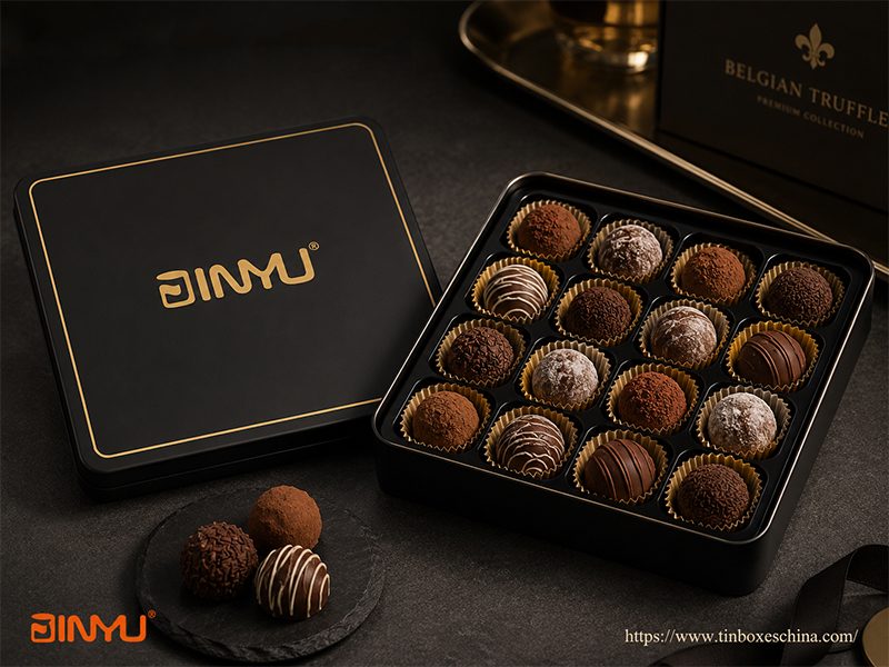
Client profile: A Belgian-inspired truffle brand launching a corporate gifting line.
Design goal: Instant luxury recognition without looking like a mass-market holiday box.
We used one of our existing shallow square tins (160×160×35 mm) in full matte black. The only decorative elements are a 0.8 mm gold foil logo centered on the lid and a thin gold line 3 mm from the edge. Inside, a black PET velvet-effect tray with 16 cavities holds each truffle securely.
Why this works:
The open space around the logo makes the tin feel confident and high-end. The matte surface resists fingerprints better than gloss during handing, which we’ve tested.
The same layout can be reused for dark, milk or assorted truffles just by changing the product card inside.
Production note from our team: Large dark matte areas do show rub marks if boxes slide against each other during shipping. We recommend adding a clear plastic sleeve or soft interleaving for bulk transport.
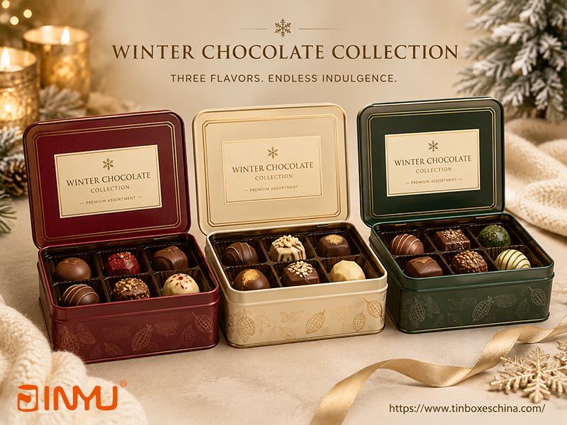
Client profile: A European chocolate maker needing a coordinated winter trio for department store retail.
Design goal: A series that signals warmth, winter flavours, and premium quality without using black.
We proposed a rectangular tin with a hinged lid, using burgundy as the hero colour for the first SKU. Copper-coloured linework defines the lid border, and a cream-coloured label block holds the product name. The sidewall carries a subtle cocoa-pod repeat pattern we adjusted to 15% opacity so it doesn’t compete with the lid. For the second and third SKU, we kept the structure identical but switched the base colour to deep cream and dark forest green, with matching accent metallics.
Result: Three distinct-looking products from one mold and one tray design. The client added milk chocolate, dark chocolate and nut assortment variants later without new tooling.
Our tip: When using metallic inks next to dark colours, keep metallic elements on the flattest part of the lid to maintain registration accuracy.
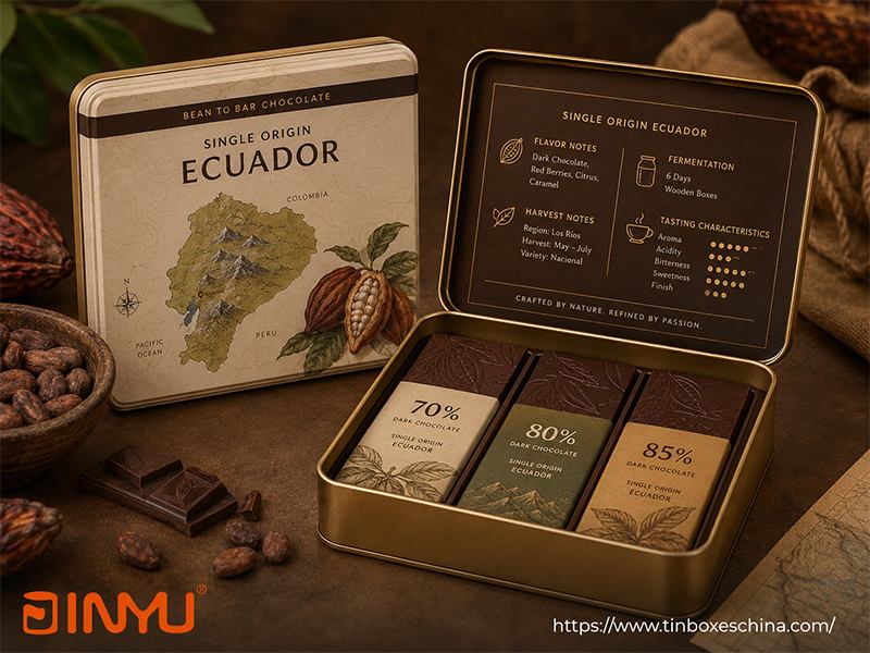
Client profile: A bean-to-bar brand sourcing from Ecuador and Vietnam.
Design goal: Make the origin information part of the visual identity, not a footnote.
We used a 180×120×40 mm rectangular tin. The lid features an illustrated map of Ecuador’s growing regions with tiny icons of cocoa pods and mountains. The brand name sits in a clean sans-serif on a solid band at the top. Inside the lid, we printed harvest notes, fermentation details, and tasting characteristics – information that would overload the outside. This gives the opening moment an educational, discovery feel.
Why it’s different from generic “farm” graphics: The map uses real place names and coordinates, which the brand shared with us. This specificity makes the design feel authentic and hard to copy.
Manufacturing check: Inside-lid printing requires careful alignment so that text isn’t distorted near the hinge or curved edges. We recommend keeping the message area at least 12 mm from the lid seams.
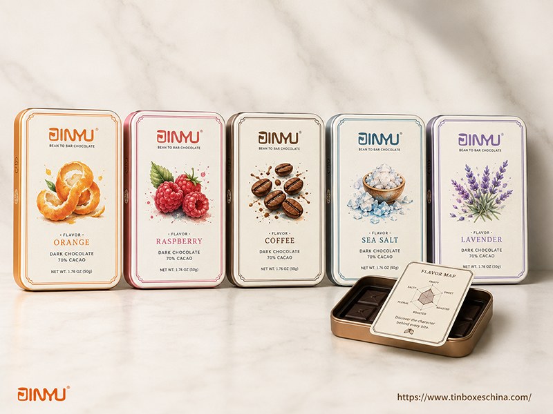
Client profile: A flavoured chocolate brand selling through specialty shops.
Design goal: Help customers identify flavours in 2 seconds from across the shelf.
We designed a uniform rectangular tin template (150×100×30 mm). The brand logo, border style and typography are fixed. For each flavour, we commissioned a single watercolour illustration of the hero ingredient – orange peel, raspberry, coffee beans, sea salt crystals, lavender – and assigned a distinct accent colour band. The product name sits below the illustration.
Scalability: The client launched with 5 SKUs. When they later added a ginger flavour, we simply created a new illustration and changed the colour band to warm terracotta. No structural changes, no new sampling round for the tin body.
Inside detail we added: A small flavour map card placed on top of the chocolates helps gift recipients navigate a mixed box.
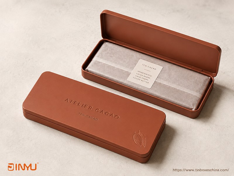
Client profile: A small-batch craft chocolate maker with a modern, architectural brand identity.
Design goal: Convey seriousness about the chocolate without looking like a gift item.
We proposed a slim rectangular tin (200×80×15 mm) in matte clay-coloured finish. Only three elements appear on the lid: the brand wordmark, “72% CACAO” in a fine weight, and a small blind-embossed cocoa pod silhouette near the bottom right. No borders, no metallic, no flavour description. The sidewalls are solid clay colour. When opened, the chocolate bar is wrapped in translucent paper with a simple ingredient sticker.
Tactile experience: The embossed cocoa pod is subtle enough that people discover it by touch. This creates a small memorable moment that reinforces the craft positioning.
Production reminder: When working with very fine typography and embossed elements, keep all critical text in the center 70% of the lid area where the surface is flattest. Avoid thin strokes crossing the lid rim or hinge line.
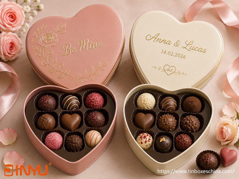
Client profile: A chocolatier offering seasonal Valentine’s and wedding ranges.
Design goal: Use one heart mold for two distinct markets.
We recommended a 140 mm wide heart tin from our existing mold library. For the Valentine’s version, the base colour is matte blush pink. A single gold line drawing of a rose wraps around the top curve, and “Be Mine” is centered where the heart is widest – avoiding the deep curves where printing can distort. For the wedding version, we changed the base to ivory, removed the rose, and added the couple’s names and date in a script font, with a small gold monogram inside the lid.
Structural note: Heart-shaped tins require a custom PET or paper pulp tray to hold chocolates neatly. We designed a 9-cavity tray that fits both versions, reducing the client’s stock-keeping complexity.
Key advice: Never put important text in the lower point of the heart – it’s the most curved area and alignment can look uneven during manufacturing.
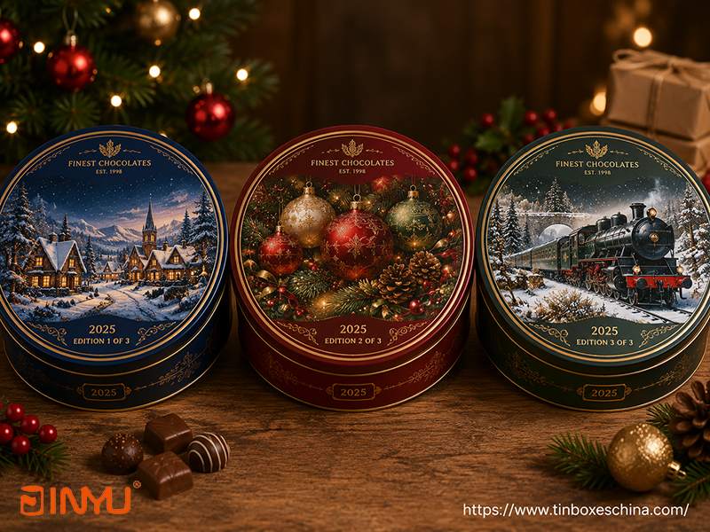
Client profile: A British retailer wanting an annual Christmas tin program.
Design goal: Encourage repeat purchases and multi-year collecting.
We designed a family of three large round tins (diameter 220 mm) using the same lid layout: a central circular illustration, a thin decorative ring, the logo at the top, and “Edition 1”, “Edition 2”, “Edition 3” discretely at the bottom. The illustrations – a snowy village, a Christmas ornament collection, and a vintage holiday train – share the same colour palette and artistic style, creating a set. A small “2025” marking on the sidewall adds year-specific detail without dominating the artwork.
Reuse factor: We deliberately avoided promotional text or discount messages on the tin itself. The decorative artwork means customers are more likely to keep the tin for storage, which extends brand presence in homes.
For production: Numbering editions in the artwork file rather than using stickers gives a more permanent, collectible feel.
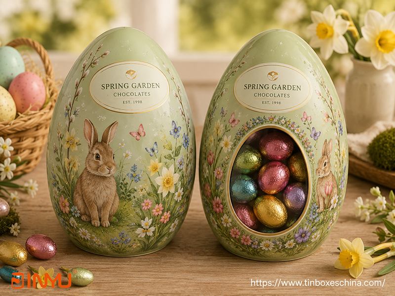
Client profile: A confectionery company expanding into seasonal Easter gifts.
Design goal: Make the egg shape part of the Easter narrative without looking juvenile.
We used an egg-shaped tin (around 175 mm tall). For the fully printed version, we applied a soft pastel green base, with a hand-drawn spring garden illustration wrapping around the curved surface. The brand area is contained in an oval band near the top. For a second SKU, we added a die-cut window in the lower half, framed by floral border artwork, so the colourful foil-wrapped eggs inside become part of the visual. Inside, a shaped paper pulp tray holds eggs in place.
Window consideration: We only recommend the window when the chocolates are consistently arranged and will not shift during transport. For mixed loose fill, a full printed lid is safer and protects contents from light better.
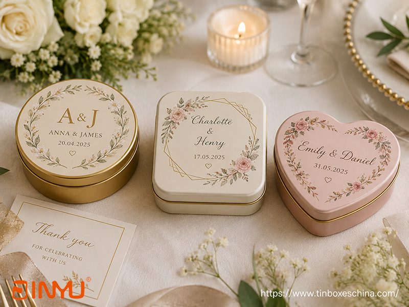
Client profile: A wedding planner and a hotel supplying guest favours.
Design goal: Offer a memorable keepsake that works across multiple wedding themes.
We keep one mold for each shape (round 55 mm, square 60 mm, heart 70 mm) and change only the lid artwork per order. For a recent hotel project, we used the round tin in soft champagne gold with the couple’s initials embossed, “Thank You” printed inside the lid, and two mini chocolates in a sealed pouch inside. The same round tin was later reused for a different event by simply changing the names and date in the print file, with no new tooling.
Flexibility for B2B clients: Hotels and event companies appreciate that the base tin is stockable, and we can deliver customised lids in smaller batches.
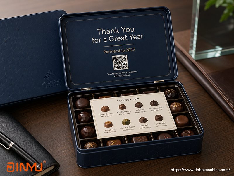
Client profile: A financial services firm sending year-end client gifts.
Design goal: Professional outside, warm personal message inside.
We chose a hinged rectangular tin (200×140×40 mm) in the company’s navy blue. The exterior features only a small blind-embossed logo in the bottom right corner and a subtle geometric pattern. When the recipient opens the tin, the inside lid reveals a warm thank-you message, the campaign theme “Partnership 2025”, and a QR code linking to a personalized video. A printed flavour map card rests on top of the chocolate tray.
Why hinge matters: The hinged lid naturally presents the message during opening, turning it into a deliberate moment rather than a hidden surprise that might be missed.
Our reminder: The inside-lid message should always be oriented to read correctly when the tin is opened normally – test opening direction before finalizing artwork.
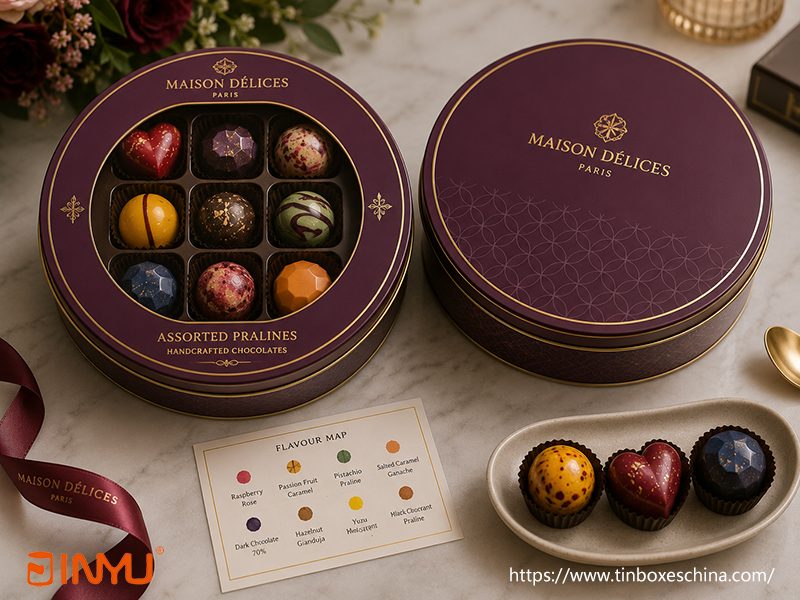
Client profile: A pâtisserie selling hand-decorated bonbons that are the main visual draw.
Design goal: Let the product sell itself through a window.
We created a round tin (diameter 120 mm) with a large central window. The printed area is limited to a 25 mm border around the window, featuring the brand name, flavour family “Assorted Pralines”, and a delicate gold frame. Inside, a custom-fit tray with compartments ensures each bonbon sits directly under the viewing area and doesn’t slide. The window film we used provides moderate UV protection.
When NOT to use a window: If the chocolates are individually wrapped in mixed coloured foils, the view can look messy. Also, some products are light-sensitive and need total dark storage.
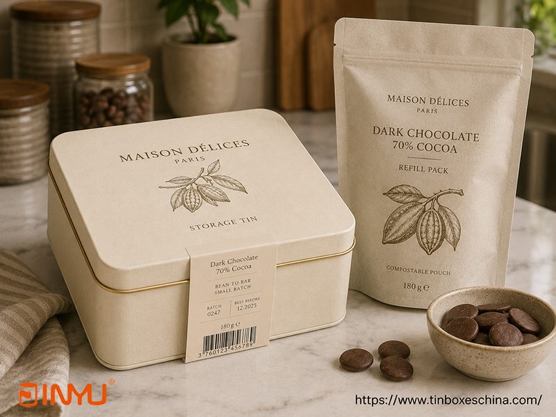
Client profile: A brand introducing a home refill program.
Design goal: Make the tin desirable to keep and reuse, while selling refills separately.
We designed a sturdy square tin (180×180×80 mm) in a warm cream colour with a subtle linen texture. The lid carries only the brand name and a small line illustration of a cocoa branch. There are no seasonal markings, discount claims, or any text that would date the design. A removable paper band wraps around the tin to provide batch info, ingredients and barcode – this band is discarded when the tin moves into home storage use. Refills are sold in compostable pouches.
Brand advantage: The tin stays in the customer’s kitchen, serving as a constant brand reminder while reducing packaging waste for repeat purchases.
When clients ask us to create a seasonal range without blowing the budget, we follow this logic:
| Element to Keep Identical | Element to Change | Practical Benefit |
| Tin shape and dimensions | Main illustration or seasonal pattern | Reuse the same mold, tray and packing line |
| Logo position and size | Accent colour | Stable brand recognition across SKUs |
| Typography family and hierarchy | Flavour name or occasion message | Easier SKU identification for retailers |
| Border or sidewall pattern | Central lid artwork | Series feels cohesive and collectible |
| Internal tray and chocolate count | Inside-lid message or insert card | No structural retooling, only print changes |
These are issues we’ve caught in client files over the years. Please review your artwork with these points in mind – or send us your design and we’ll run the check for you.
Keep logos, small text and faces away from deep curves, lid seams and rolled edges.
Embossing works best for distinct shapes, seals and borders – avoid ultra-fine lines below 0.5 pt.
A window reduces the printable lid space and demands a fixed product layout underneath; don’t add it as an afterthought.
Matte dark colours and metallic finishes can show rub marks; plan a protective sleeve or interleaving.
Check the lid opening direction before designing the inside-lid message.
Test the real chocolate sizes with the tray cavities – not just the nominal dimensions.
For most new brands and seasonal collections, we recommend starting with our existing mold library (rectangles, squares, rounds, hearts, eggs, and hinged shapes in multiple sizes). This saves tooling investment and shortens lead time to 2-3 weeks for samples. Once a shape has proven its market fit and order volume justifies the cost, we can develop a fully custom mold tailored to your product.
Have a design concept in mind? Tell us your chocolate sizes, quantity per box, and the visual style you’re aiming for. We’ll suggest the closest existing tin shape, show you a tray layout, and provide a digital mockup – usually within 48 hours.
Get The Latest Information And Special Offers


 IPv6 network supported
 English
 Français
 Deutsch
 Español
 Português