
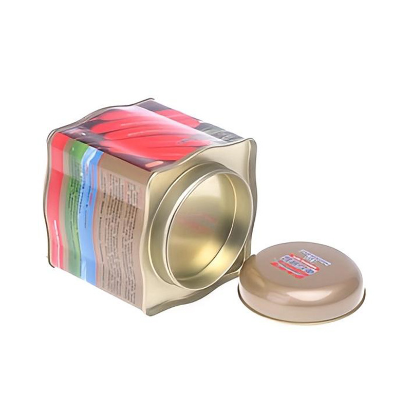
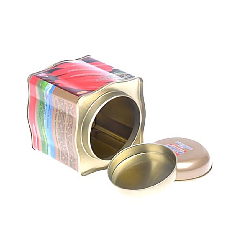
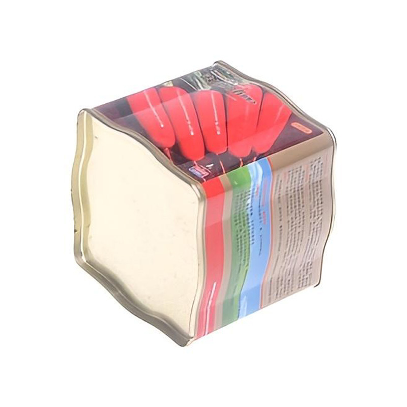
A custom printed double lid tea tin gives private label tea brands more control over how the packaging communicates before the customer even opens the product. Instead of treating the tin as a standard metal container with a logo added at the end, the body, outer lid, inner lid and finish can be planned as one coordinated brand system. This format is suitable for loose leaf tea brands, speciality tea collections, premium gift ranges, retailers and distributors developing their own private label packaging. Custom artwork can be applied directly to the metal surface using offset printing, with Pantone colour matching and selected decorative finishes available according to the design.
Product Name :
Square Tea Tin Box with Double LidsDimensions :
L95*W95*H95mmShape :
Square, CustomizableDesign :
Customizable, ODM / OEMPrinting :
Offset (CMYK) / UV / PantoneSurface Finish :
Matte / Glossy / EmbossingMaterial :
0.23 mm Food-Grade TinplateMOQ :
5,000 pcsLead Time :
35 DaysPackaging :
Opp Bag + Master Carton
For a private label project, the first question is not simply “Where should the logo go?”
A stronger approach is to decide how the complete product range should look when several tins are placed together.
For example, a tea brand may keep the same logo position, typography and decorative pattern across the full range while changing one main colour for each blend.
This approach makes each SKU recognisable without making every tin look unrelated.
For factories, it also creates a clearer printing system because the fixed brand elements and variable SKU elements can be identified before artwork approval.
The outer lid is usually the first surface the customer sees, so it should not be treated as leftover printing space.
On many private label tea tins, the lid works best when it carries only the most important visual information:
The body can then carry supporting information such as origin, flavour notes, preparation guidance and regulatory labelling.
This creates a clearer visual hierarchy than trying to place every piece of information on the lid.
A double-lid structure gives the brand one additional surface that a single-lid tea tin does not have.
After the customer removes the decorative outer lid, the inner lid becomes visible. Depending on the selected structure and production plan, it can remain plain or use a coordinated colour treatment.
For some private label programmes, keeping the inner lid visually simple works better because it creates contrast with a highly printed exterior.
For others, the inner lid can carry a small logo or secondary brand element where technically suitable.
The important point is that the two lids should be designed as part of one opening sequence rather than as two unrelated components.
Both approaches have a role in custom tea tin printing.
CMYK offset printing is commonly used for:
Pantone colour matching is useful when a brand has specific corporate colours that need to remain consistent across packaging materials.
Many projects use both approaches. Pantone references can guide important brand colours while CMYK is used for the more complex parts of the artwork.
Because printed metal reflects light differently from paper or a computer monitor, colour approval should be based on the actual printing process rather than relying only on an on-screen preview.
Artwork prepared for a cardboard box does not always transfer directly to tinplate without adjustment.
Metal has its own visual characteristics.
When selected areas of the artwork allow the metallic substrate to influence the finished appearance, the result can create a brighter metallic effect that would not be possible on conventional white paperboard.
At the same time, colours printed over a white base layer can appear more solid and closer to conventional printed packaging.
During artwork development, the design team should therefore decide which areas should appear:
This decision should be made before final plate preparation rather than after the tin has already been printed.
A premium tea tin does not need every available decorative process at the same time.
In many cases, one or two well-selected finishes create a stronger result than combining too many effects.
Available options can include:
A minimalist speciality tea brand may prefer a matt surface with a small embossed logo. A traditional gift tea may use detailed illustration with metallic elements. A modern private label range may rely on solid colour blocks and clean typography.
The finish should support the brand identity rather than become the identity itself.
Embossing is one of the most frequently requested features for custom tea tins, but not every graphic element is suitable for embossing.
Small text, very thin lines and highly detailed illustrations may not produce a strong three-dimensional effect after forming.
Simple logos, borders, symbols and larger decorative shapes normally give the designer more room to work.
The embossing area also needs to respect the lid edge, forming zones and other structural features of the tin.
For this reason, we recommend confirming the intended embossed area before the final artwork is locked.
Printed metal is decorated while it is still flat and is then formed into the final tin components.
That means the artwork has to account for areas that will later become rolled edges, corners, seams or strongly formed surfaces.
Fine text and critical logo details should not be placed too close to these areas.
When reviewing a private label artwork file, we pay particular attention to:
This is one of the practical differences between designing a flat printed label and designing directly for a formed metal package.
If the brand expects to launch several flavours, it is usually better to develop the full visual system early.
Suppose the first production order contains four tea varieties. Instead of treating them as four completely separate designs, the artwork can be organised into fixed and variable elements.
Fixed elements may include:
Variable elements may include:
This creates a coherent private label collection and reduces the risk of design inconsistency as more SKUs are added later.
One point that should be clarified early in a multi-SKU project is how the quantity is divided between different artworks.
Our standard custom production MOQ is 5,000 pieces per design.
For example, four different printed tea varieties should not automatically be treated as one 5,000-piece production run simply because they use the same metal structure.
Each artwork requires its own printing and production planning.
If your project involves multiple designs, tell us the required quantity for each SKU when requesting a quotation.
A catalogue image can confirm the general structure of the tin, but it cannot confirm how your final brand colours and graphics will look on metal.
For custom printed projects, the artwork approval process is therefore one of the most important stages before mass production.
A typical workflow is:
For projects where brand colour is particularly important, physical colour approval should be discussed before full production.
For the smoothest artwork review, editable vector files are preferred for logos and key graphic elements.
Useful file formats can include:
Images used inside the artwork should be supplied at suitable print resolution.
Fonts should be outlined or supplied according to the artwork workflow, and Pantone numbers should be identified where specific colour matching is required.
If your brand only has a logo and basic concept rather than a finished tin artwork file, the project can begin with the available brand assets and required product information.
Not every piece of product information needs to be permanently printed into the metal.
Batch numbers, best-before dates, importer information and some market-specific labels may change between production runs or destinations.
Where appropriate, the artwork can leave a clean area for:
This can give a private label programme more flexibility when the same core tin is supplied to several markets.
Private label artwork sometimes includes marketing terms such as “airtight”, “freshness sealed” or “100% sealed”. These claims should not be added simply because the tin uses two lids.
A fitted inner lid can improve closure performance and create a second barrier between the tea and the surrounding environment, but double lid does not automatically mean hermetically airtight.
If a brand intends to make a specific barrier or freshness claim, the complete package should be evaluated under the intended filling and storage conditions.
For loose leaf tea requiring controlled moisture and aroma protection, an appropriate sealed inner pouch can also be considered.
Exterior printing and food-contact suitability are two different parts of the packaging specification.
If the tea is sealed inside an inner pouch, the metal tin normally functions as secondary packaging and a reusable outer container.
If loose tea will directly contact the interior of the tin, the internal coating and complete food-contact system should be reviewed for the intended product and destination market.
A statement such as “food-grade tinplate” alone should not replace confirmation of the complete contacting materials.
For a custom printed project, the following details help us prepare a more useful quotation:
If the final tin design has not yet been completed, send your logo, brand colours, preferred packaging style and required product information first. These details are enough to begin reviewing suitable structures and artwork direction.
Yes. The outer lid and body can be developed as separate artwork areas while maintaining one coordinated brand identity.
The available treatment depends on the selected double-lid structure. It may remain plain or use a coordinated colour or selected branding treatment where technically suitable.
Yes. Using one consistent layout with different colours for individual tea varieties is a common way to build a coordinated collection.
Pantone references can be used as the target for important brand colours. Because metal, varnish and printing conditions influence the final appearance, physical sample approval is recommended where colour consistency is critical.
Embossing is best planned during artwork development. The location and detail level need to match the forming area and embossing structure.
Not automatically. Double-lid construction and airtight performance are separate issues. Specific barrier claims should be supported by the appropriate finished-package evaluation.
Standard custom production starts from 5,000 pieces per design.
Send us your logo, brand colours, tea varieties, estimated quantity per design and preferred tin style. We can review the artwork requirements together with suitable double-lid structures before sample production.
For multi-SKU projects, please list the required quantity for each artwork separately when requesting a quotation.
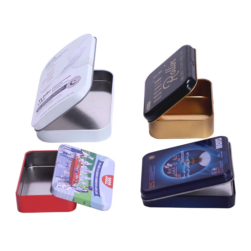
This small rectangular hinged tin box is designed for candy, mint, chewing gum, tablets, and other compact products that need easy one-hand opening and reliable re-closing. Instead of using a loose slip lid, the metal box with hinged lid keeps the top attached to the body, making the format more practical for pocket carry, promotional packaging, and repeat daily use, this product is a classic small-format solution with strong OEM and wholesale potential.
Read More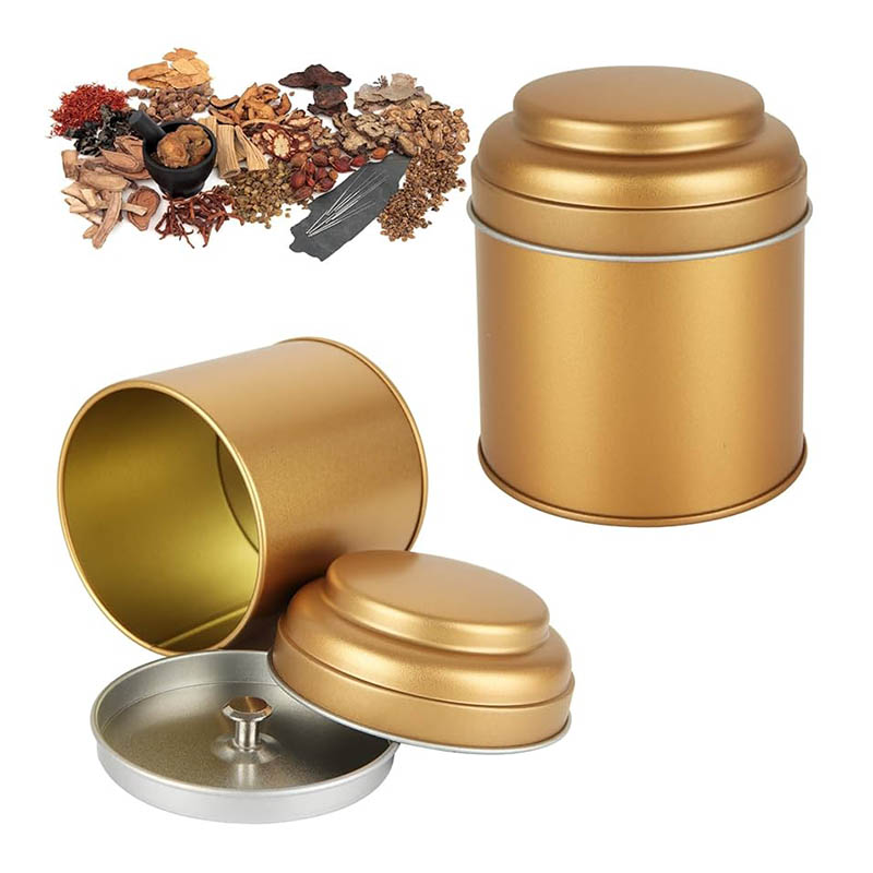
Working with an OEM ODM double lid tea tin canister manufacturer is different from buying a finished storage tin from a catalogue. For commercial tea packaging, buyers often need several decisions to be coordinated at the same time: tin dimensions, double-lid structure, filling volume, artwork, printing, inner packaging, food-contact requirements, export packing and repeat-order consistency.
Read More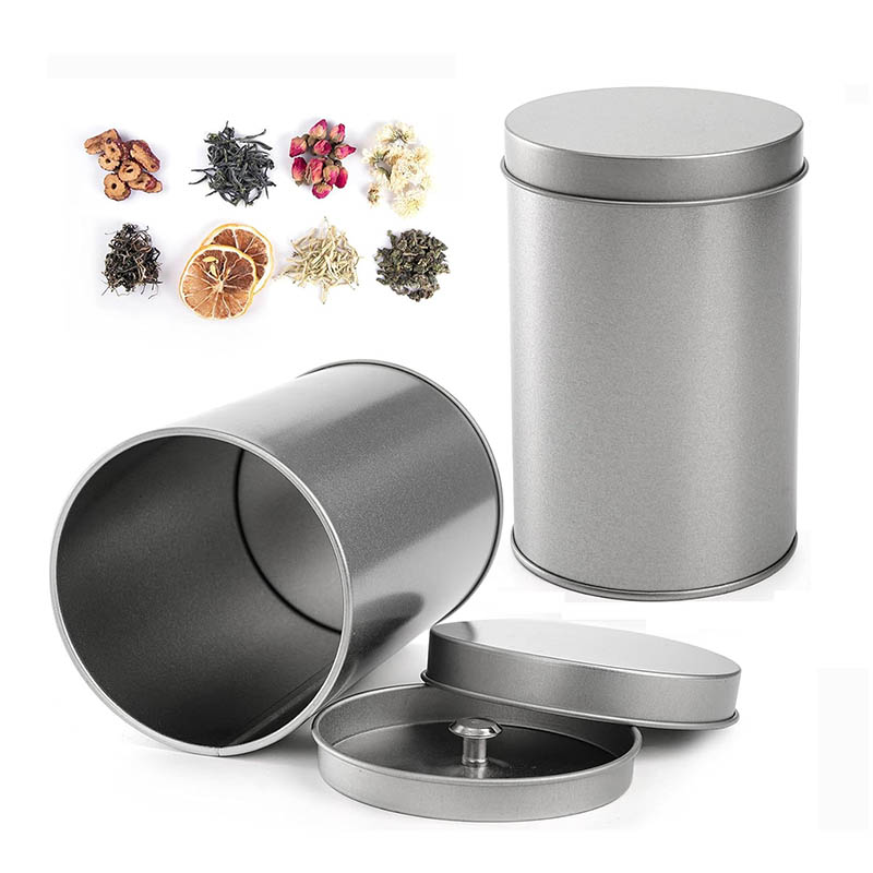
A custom cylindrical double lids tea tin canister is designed for tea brands that want more than a decorative metal container. The two-stage lid gives the pack a distinctive opening experience: the customer removes the outer lid first, then opens a second inner lid before reaching the tea. This structure is particularly well suited to loose leaf tea, premium tea collections, gift assortments and private label ranges where the container is expected to remain useful after purchase. The cylindrical body also provides a large continuous printing area for branding, illustrations, origin stories and colour-led tea collections.
Read More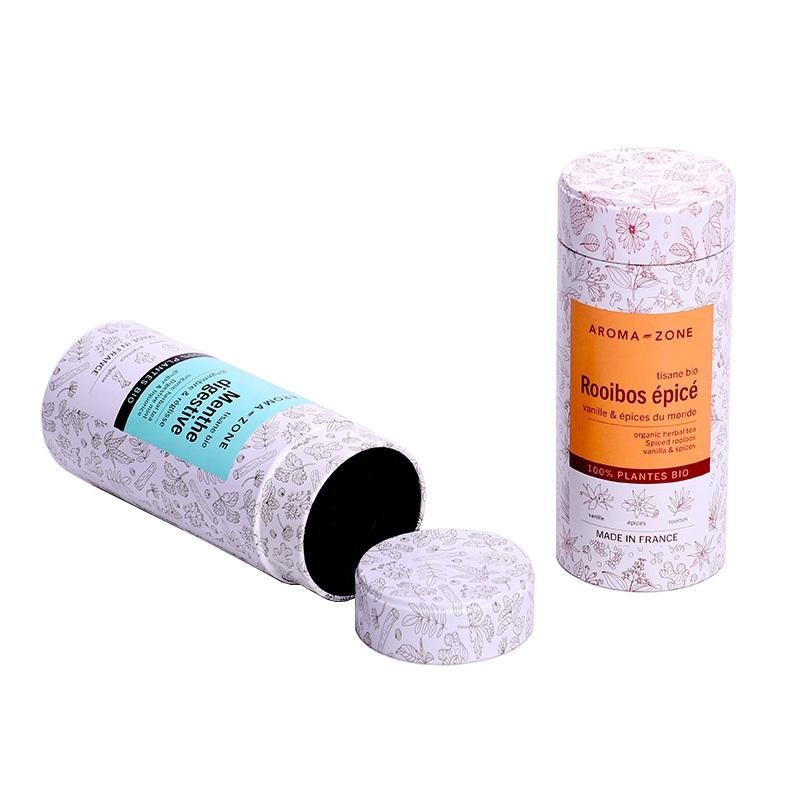
Our custom slim tall tea tin canister is designed for tea brands that need compact shelf presentation without reducing branding space. Its narrow footprint and vertical body make it suitable for individually wrapped tea bags, loose leaf tea, herbal blends and refill collections. The tall format gives buyers more room for vertical logos, tea-origin stories, brewing instructions and coordinated colour systems. The size, lid structure, printing, internal packaging and retail presentation can be developed around the actual tea format rather than using a generic storage tin.
Read More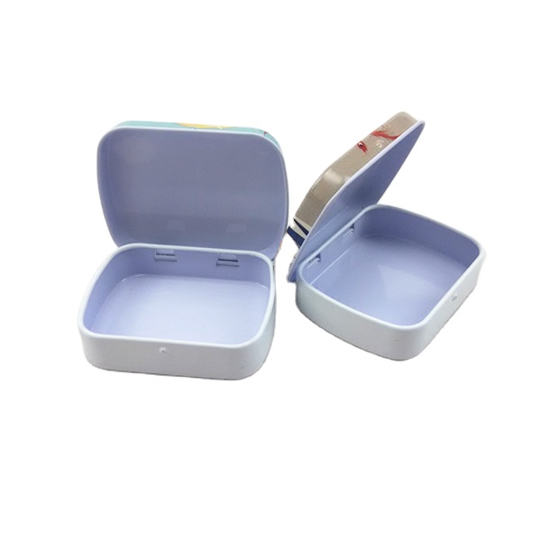
This compact rectangular hinged tin is designed for breath mints, chewing gum, candy tablets, lozenges, and other small-format products that need quick opening, repeat daily use, and pocket-friendly portability. The attached lid keeps the pack easy to handle, while the flat rectangular face gives enough room for logo printing, flavor names, and promotional artwork. For brands developing a gum tin, a gum tin can, or a mini candy mint tin box, this format remains one of the most practical choices in retail and promotional packaging.
Read More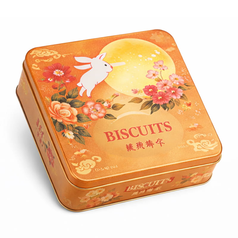
This custom square cookie and biscuit tin box is designed for brands that need stronger product protection, premium shelf presentation, and reusable metal packaging for retail or gift applications. As a biscuit tin manufacturer in China and food tin manufacturer for export projects, Jinyu supports custom biscuit tin packaging for butter cookies, finger biscuits, assorted biscuits, and premium luxury biscuit packaging programs.
Read More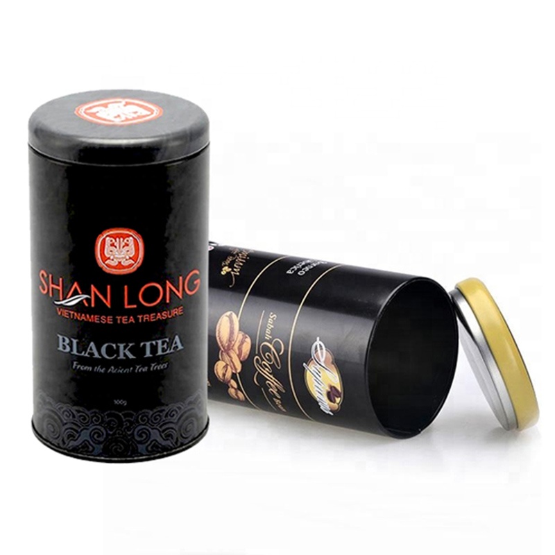
This cylinder black tin canister is designed for brands that need a cleaner, more premium alternative to flexible bags for coffee beans, tea, cocoa, and other dry foods. As a coffee tin manufacturer in China, Jinyu supports custom coffee tins, personalized coffee canisters, custom tea tins, and export-ready coffee tin packaging for brands, roasters, wholesalers, and private-label projects.
Read More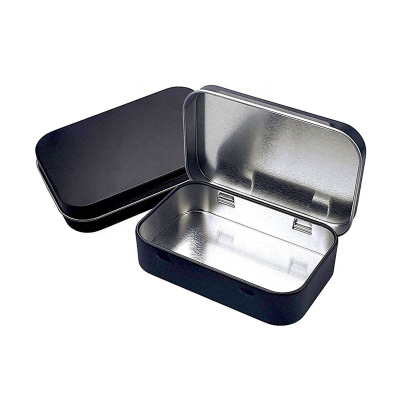
Great for storing small items such as coins, jewelry, and other trinkets. Perfect for gifting small items such as chocolates, candies, and other treats. Durable and can withstand wear and tear. Multiple of sizes, colors, and shapes, making them ideal for a variety of uses. Good option for giving as gifts, as they can be personalized with a special message or design.
Read More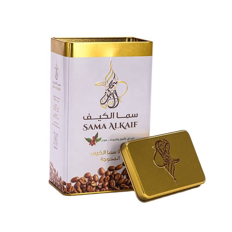
A custom rectangular double lid tea tin box combines a space-efficient metal body with a two-stage closure for premium loose leaf tea, tea bags and private label tea collections. Unlike a round canister, the rectangular format provides four defined side panels, making it easier to organise branding, product information, brewing instructions and origin stories around the package. For tea brands working with several flavours or retail SKUs, rectangular tins also make practical use of shelf, gift-box and export-carton space. The structure can be developed around an existing mould or adapted to suit the dimensions of an inner tea pouch, individual sachets or a required filling volume.
Read More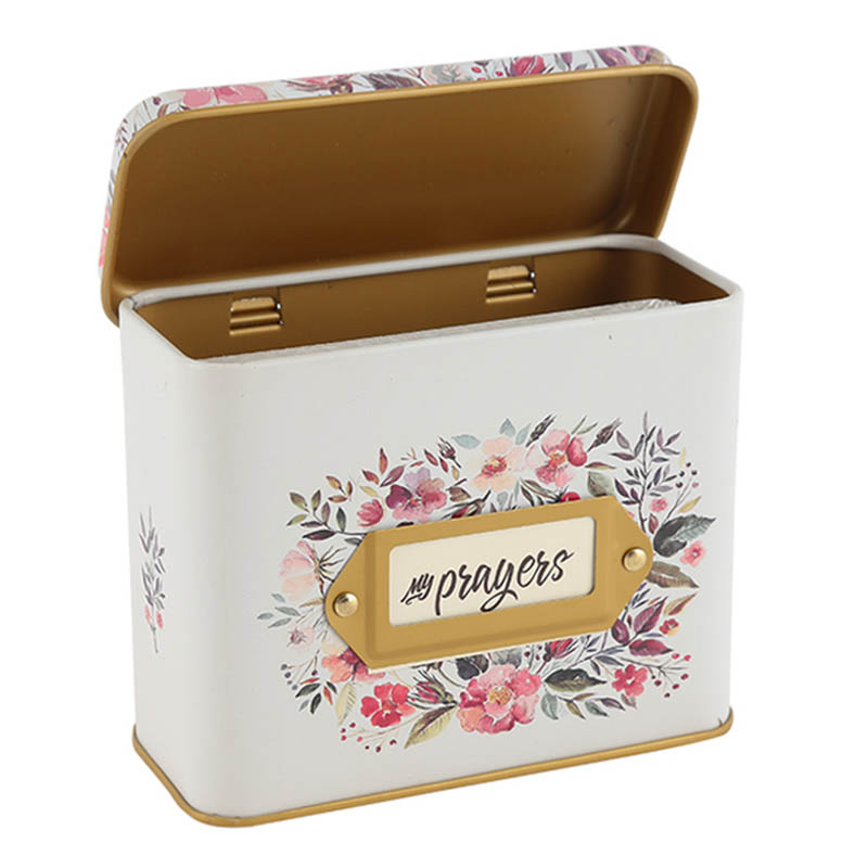
Custom wholesale metal card container tin prayer boxes provide a durable and reusable packaging solution for prayer cards, inspirational messages, keepsakes and small meaningful items. Designed for bulk purchasing and private label projects, these metal prayer tins combine practical storage with custom branding opportunities. The rigid tinplate structure offers a premium alternative to paper packaging while allowing manufacturers, wholesalers and retailers to create unique product collections.
Read More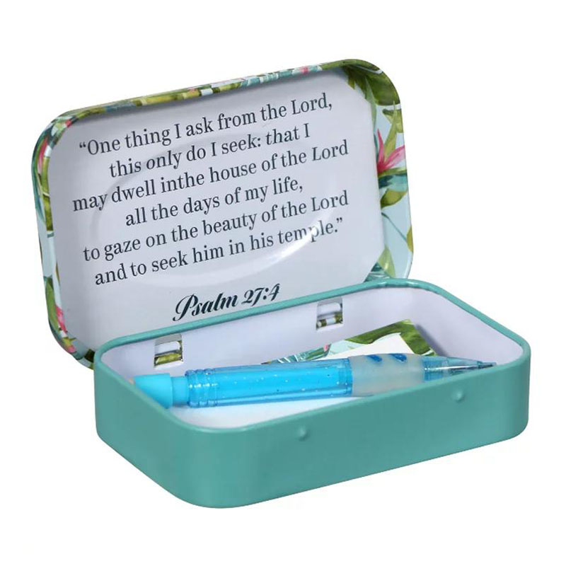
This rectangular hinged metal box is designed for playing cards, poker or bridge sized accessory decks, prayer cards, credit or gift cards, and other flat-format products that need cleaner protection than a paper tuck box. The lid stays attached to the body for easier handling, while the metal shell gives the pack a more durable, reusable, and collectible feel. For brands sourcing a playing card tin box, a gift card tin box, or a China prayer box tin, this format combines practical storage with a strong custom-print surface.
Read More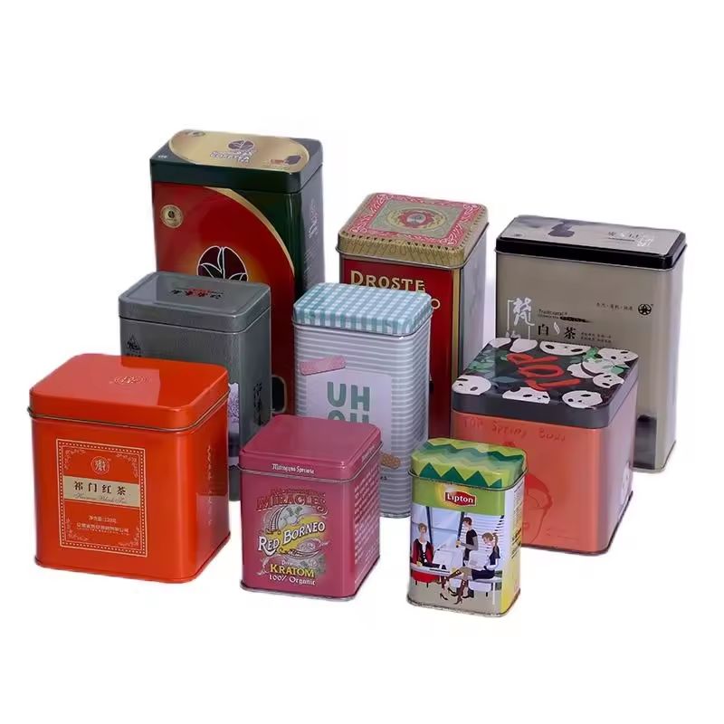
This rectangular loose leaf tea tin box is designed for tea brands that need practical storage, premium presentation, and efficient shelf display. The stackable metal structure is suitable for green tea, loose leaf tea, herbal tea, oolong tea, black tea, tea samplers, and seasonal tea gift packaging. As a China loose leaf tea packaging factory and tea packaging container wholesale factory, Jinyu supports OEM and ODM tin packaging projects with custom printing, size evaluation, mold selection, food-grade tinplate, and export packing solutions for global tea brands and packaging distributors.
Read More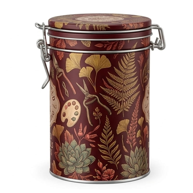
This round clip-clasp tea canister is designed for buyers who need more than a standard slip-lid tea tin. It combines a rigid food-grade tinplate body, a latch-lock closure, and a rubber-sealed lid to create a stronger storage format for loose-leaf tea, tea bags, dry herbs, and coffee. For searching tea tin manufacturer or custom tea tin cans, this product sits at the point where everyday usability and export-ready customization meet.
Read More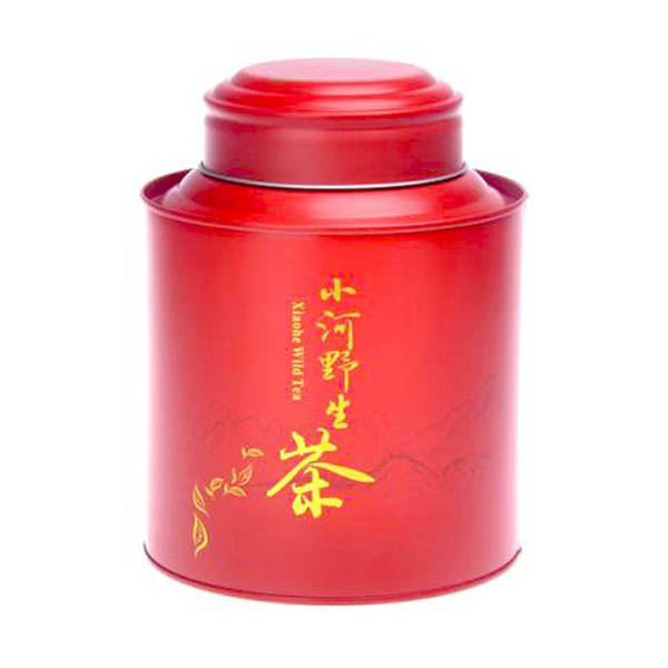
A 500g double lids tea tin canister is intended for tea brands, wholesalers and private label programmes that need a larger metal package for loose leaf tea, tea refills or premium family-size products. However, “500g” should be treated as a target filling weight rather than a fixed tin size. Four hundred grams of compact rolled tea can occupy a very different volume from 500 grams of large-leaf black tea, herbal blends or flower tea.
Read More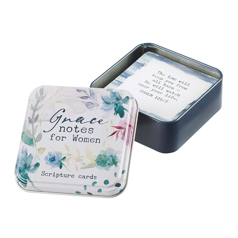
A personalised square tin prayer box provides a meaningful and durable metal container for prayer cards, inspirational messages, keepsakes and personal collections. Designed with a compact square structure, this custom card tin container combines practical storage with emotional value. The metal surface allows brands, organisations and gift suppliers to create personalised artwork, messages and decorative designs.
Read More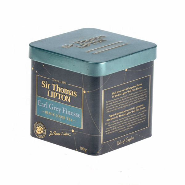
This square embossed tea caddy is designed for brands that want a compact 100g tea tin with stronger shelf presence than a simple paper carton, and more collectible appeal than a plain refill canister. It fits buyer searches around square tea tins, OEM tea caddy tins, custom embossed tins, tea caddy tin exporters, and vintage-style Lipton tea container projects.
Read More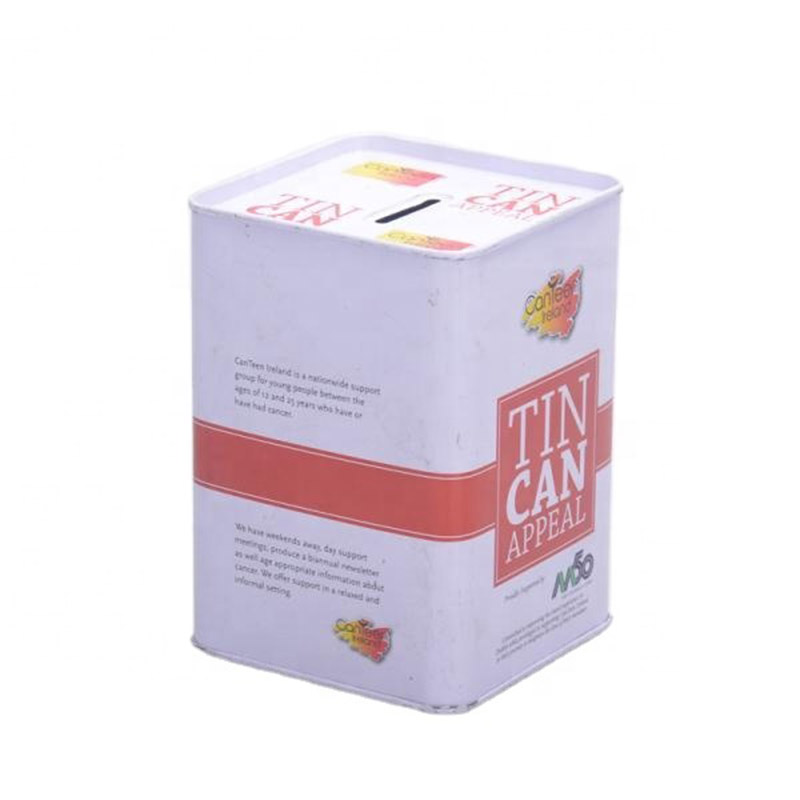
Long-lasting quality and can be utilized repeatedly. Secure savings and safeguard money against theft. Diverse range of sizes and styles, help to discover one that suits your requirements. Used as gifts for children and friends, and great way for commercial brand promotion. Reliable factory direct supplier, high quality with competitive price.
Read More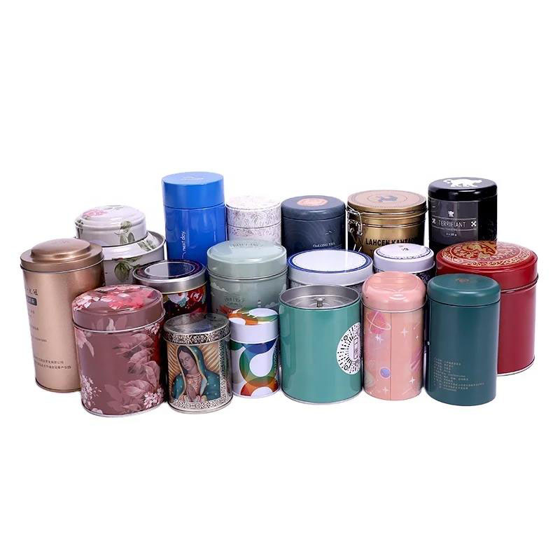
This custom coffee capsule tin case is developed for coffee roasters, capsule coffee brands, hospitality suppliers, retailers, importers and private-label buyers creating organised coffee pod collections and premium gift packaging. Unlike a standard coffee bean canister, this product is designed around the number, diameter and arrangement of individually sealed coffee capsules. A fitted insert holds each pod in position, while the printed metal case provides protection, brand presentation and reusable storage value.
Read More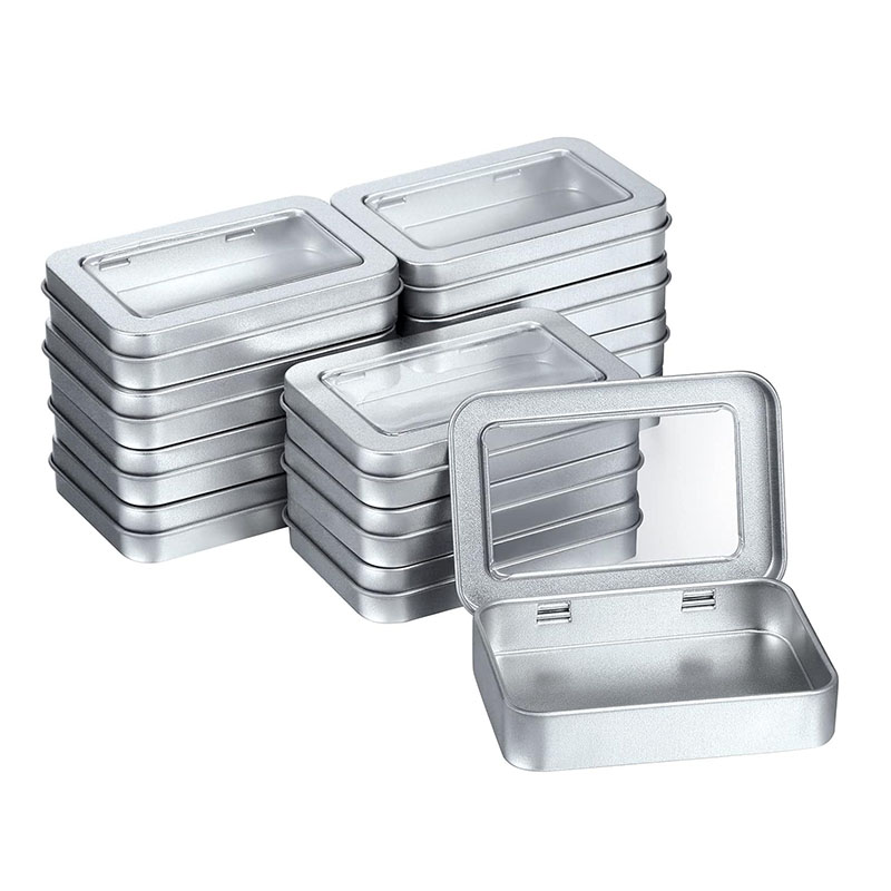
Wide range of tin packaging solutions for you to choose from, covering the full range of products. Modern process brings a good seal and long storage time. Well-known partners include leading brands such as Mentos, Tic Tac, Altoids. Premium quality tinplate material ensures that the tin provides a perfect seal. Professional design team, advanced printing equipment, perfect presentation.
Read More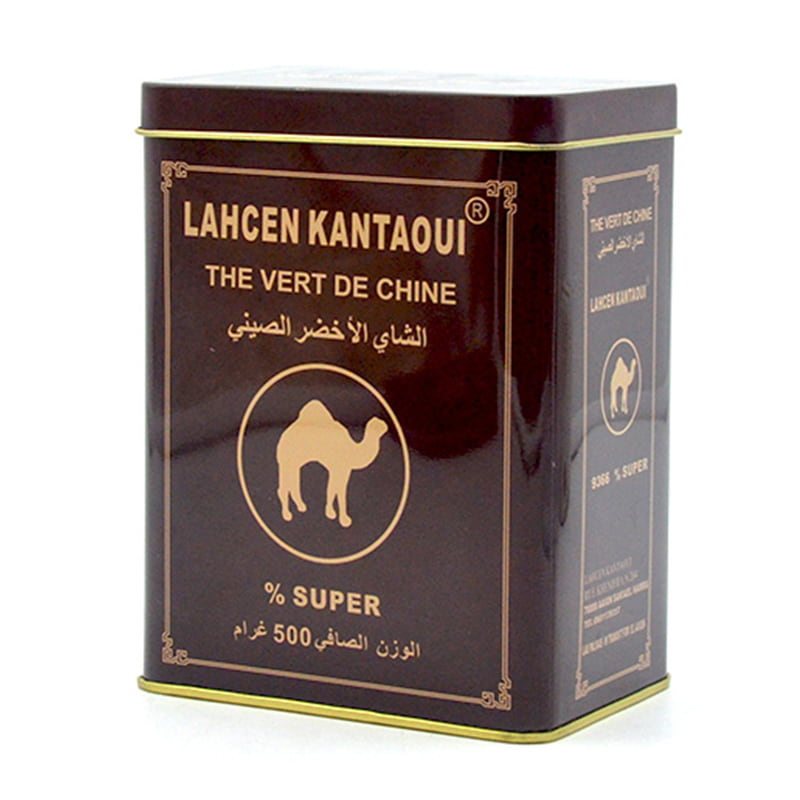
Whether retail or wholesale, our coffee tin packaging adapts to all market demands. Your coffee stays fresher, longer, thanks to our modern sealing systems. Our tins help famous coffee brands preserve flavor and build visual identit Safe, sealed, and sanitary—our coffee tins keep your beans protected. Grab attention with beautifully printed coffee tins in sharp, vivid colors.
Read More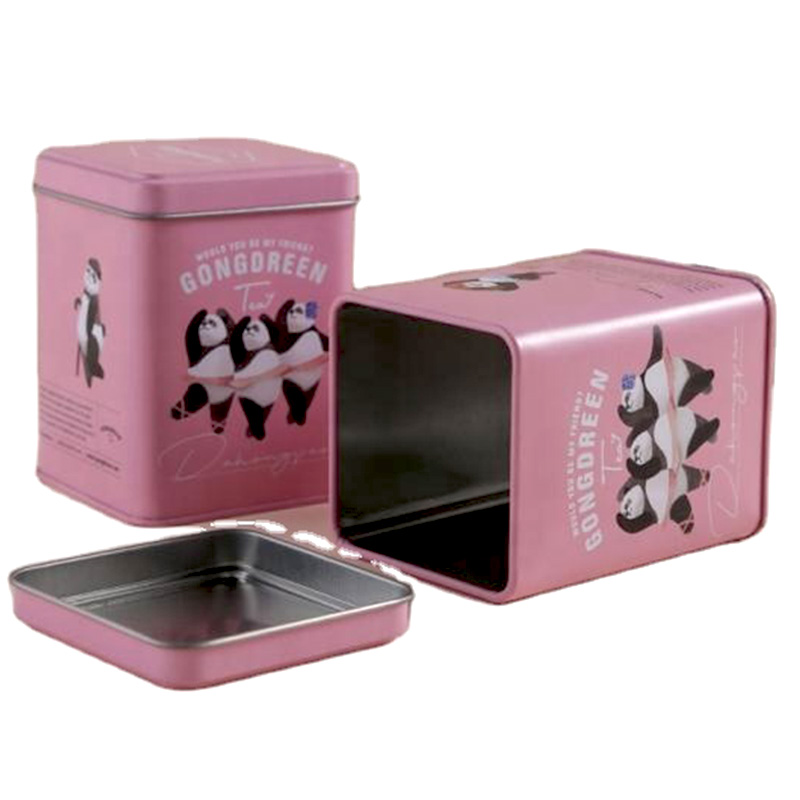
Airtight seal to keep tea fresh for longer. Offer comprehensive tea packaging services, from design to production, packaging and distribution. Well-known brands selling tea around the world are our long-term customers, such as Twinings, Tetley, Bigelow. Attractive and eye-catching way to dareplay your tea products. Professional Pantone and 4-color printing equipment,creating full, vibrant, printed color with unique designs.
Read More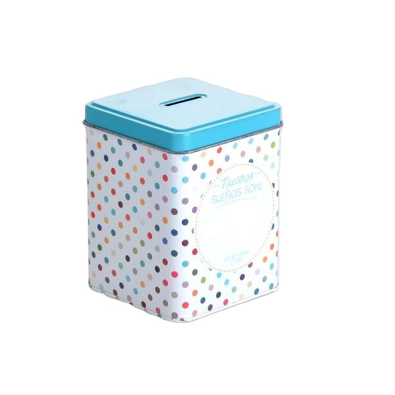
Long-lasting quality and can be utilized repeatedly. Secure savings and safeguard money against theft. Diverse range of sizes and styles, help to discover one that suits your requirements. Used as gifts for children and friends, and great way for commercial brand promotion. Reliable factory direct supplier, high quality with competitive price.
Read More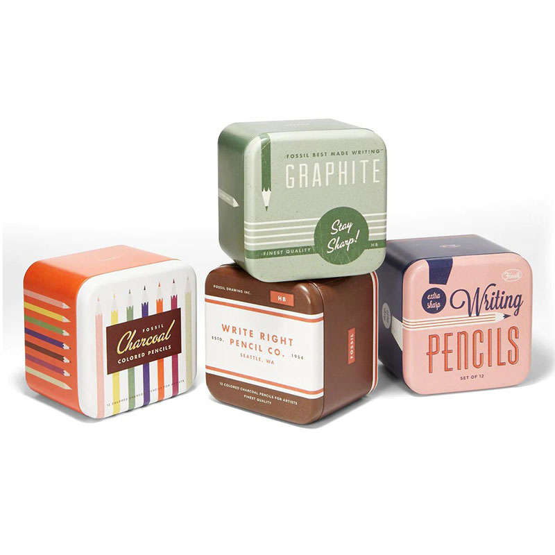
These containers are crafted for easy storage and organization, with a design that allows them to be stacked. Versatile in use, these containers can be reused for storing items or as decorative pieces. Select from a variety of sizes, colors, and designs that can perfectly match your specific needs. The containers feature a simple hinged flip lid structure, ensuring effortless opening and closing. Their durable tinplate construction ensures longevity and resistance to wear and tear.
Read More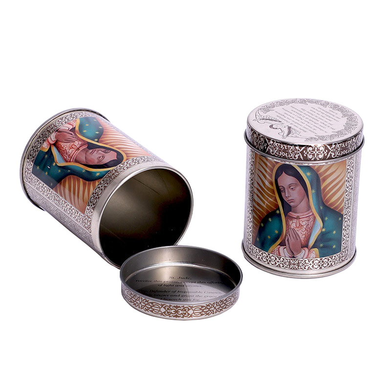
Durable and versatile for various applications. Guarantees an airtight seal, maintaining the tea's flavor and aroma. Available in a wide range of sizes and styles, making it easy to find one that meets your needs. Used to store a variety of items, including spices, herbs, and loose-leaf teas. Extremely sturdy, offering protection for your tea from moisture, light, and air.
Read More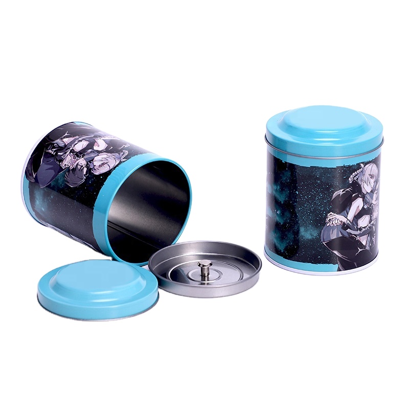
A custom printed round coffee tea metal tin can be used as a common packaging format across both tea and coffee product ranges, particularly where a brand wants a reusable metal container with a consistent shelf appearance. The round body provides a continuous printable surface, while the outer lid and fitted inner lid create a two-stage opening structure. By keeping the same basic tin architecture and changing the artwork between products, buyers can build separate tea and coffee SKUs without developing an entirely different container for every item.
Read More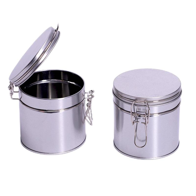
Choose from a range of coffee tin packaging solutions. Advanced processes ensure good sealing and long-term storage for your coffee beans. Lipton, Twinings, and Tetley are among the famous tea brands that are our loyal customers. FDA-approved food-grade tinplate ensures the absolute safety of your coffee packaging. Professional Panton and 4-color printing equipment ensure high-quality presentation of the tin boxes.
Read More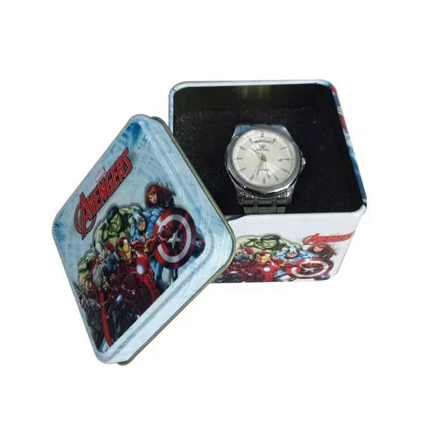
Made of food grade tinplate, adaptable for various applications. Sturdy and protection against moisture and light, long preserve of the contents. Offers multiple sizes and styles, easily to fits your diversified demand. Customizable with logos and designs, meet brand or individual needs of packaging. Reused for storage or as decorative items, recyclable and environmentally friendly.
Read More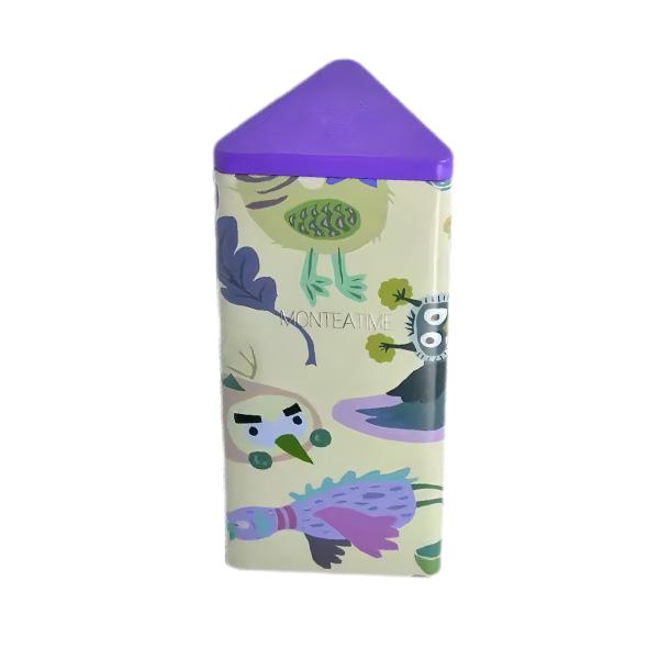
Made of food grade tinplate, adaptable for various applications. Sturdy and protection against moisture and light, long preserve of the contents. Offers multiple sizes and styles, easily to fits your diversified demand. Customizable with logos and designs, meet brand or individual needs of packaging. Reused for storage or as decorative items, recyclable and environmentally friendly.
Read More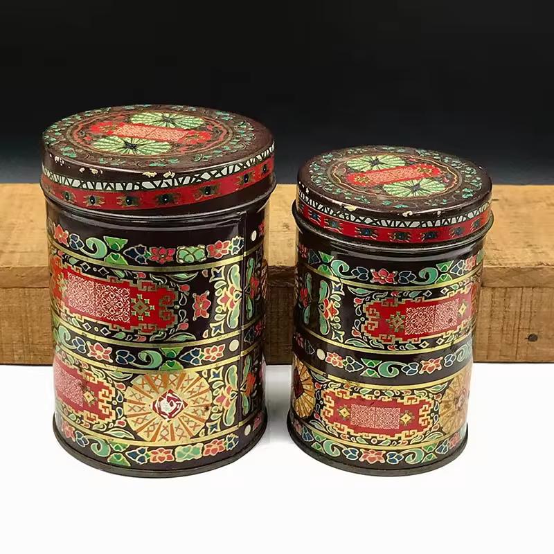
Whichever type of tea can packaging solution you need, we offer the right option for you. Using a more professional process, your tea tin box achieve an excellent seal and a longer shelf life. Well-known partners include leading brands such as Lipton, Twinings & Tetley. The tea containers are manufactured from FDA approved food grade tinplate and with a fluted lid to ensure the tea stays fresh. With a team of highly skilled designers and state-of-the-art printing technology, we ensure the best presentation of tea packaging tin cans.
Read More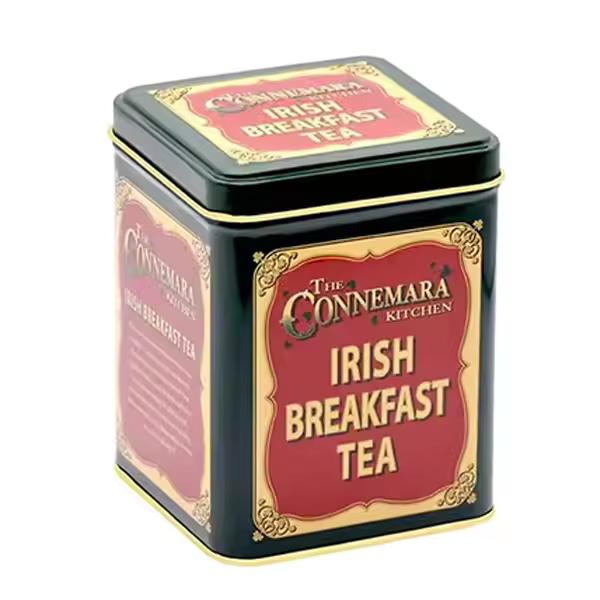
Airtight seal to keep coffee fresh for longer. Offer comprehensive coffee packaging services, from design to production, packaging and distribution. Well-known brands selling coffee around the world are our long-term customers, such as Twinings, Tetley, Bigelow. Attractive and eye-catching way to dareplay your coffee products. Professional Pantone and 4-color printing equipment,creating full, vibrant, printed color with unique designs.
Read More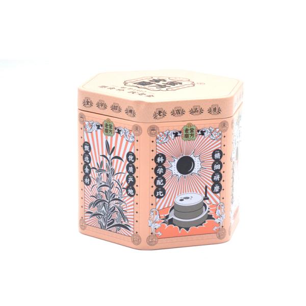
Variety of tea canister packaging options to enhance the quality of your tea. Made from sturdy, food-grade materials that are designed to last for years. Easily on shelves or in cabinets, making them great for organizing your kitchen. Great gifts for any occasion, from birthdays to holidays Variety of sizes, making it easy to find the perfect one for your needs.
Read More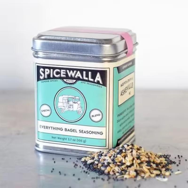
Small spice products need packaging that is easy to handle, simple to store, and distinctive enough to support a recognizable brand identity. This small square chilli pepper tin box is designed for spice companies, seasoning brands, gourmet food suppliers, gift-set manufacturers, and private label buyers looking for compact metal packaging for dried chilli, pepper, herbs, and seasoning blends. The square footprint makes efficient use of shelf and pantry space, while the metal body provides a durable alternative to lightweight paper cartons or disposable pouches. Custom printing can turn the tin into part of the product presentation rather than simply a storage container.
Read More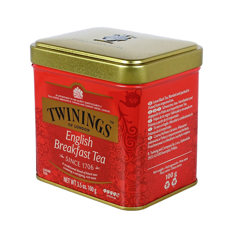
Airtight seal to keep coffee fresh for longer. Offer comprehensive coffee packaging services, from design to production, packaging and distribution. Well-known brands selling coffee around the world are our long-term customers, such as Twinings, Tetley, Bigelow. Attractive and eye-catching way to dareplay your coffee products. Professional Pantone and 4-color printing equipment,creating full, vibrant, printed color with unique designs.
Read More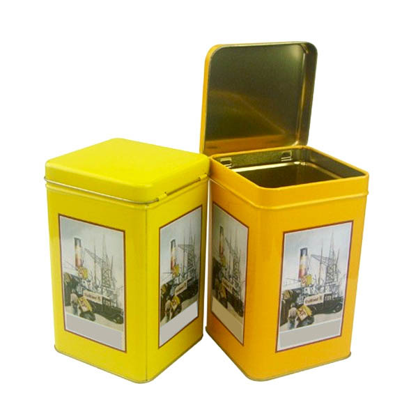
Help to preserve the freshness of your tea for longer. Increase the perceived value of your tea products. Secure, airtight seal that helps preserve the freshness and flavor of tea. Food grade tinplate is durable and can withstand the rigors of shipping and handling. Variety of sizes and shapes, making it easy to find the perfect fit for your product.
Read More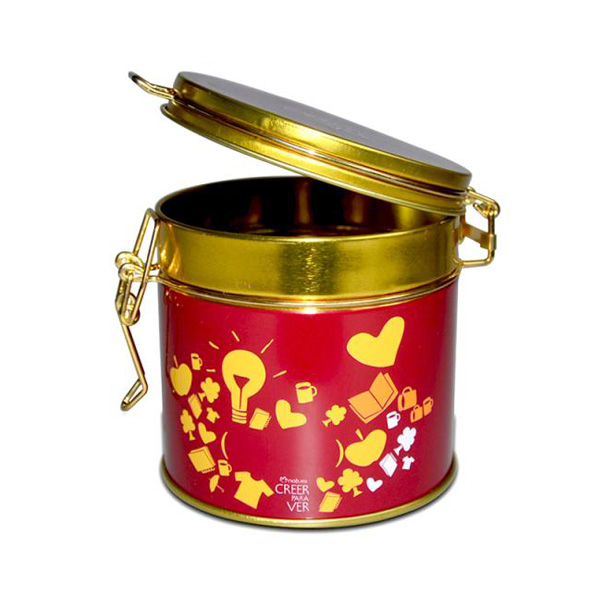
Choose from a range of coffee tin packaging solutions. Advanced processes ensure good sealing and long-term storage for your coffee beans. Lipton, Twinings, and Tetley are among the famous tea brands that are our loyal customers. FDA-approved food-grade tinplate ensures the absolute safety of your coffee packaging. Professional Panton and 4-color printing equipment ensure high-quality presentation of the tin boxes.
Read More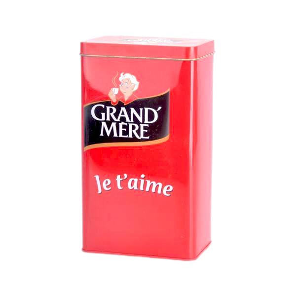
We stock a series of tea can packaging solutions for you to choose from. Improved process will provide an effective seal and long-term storage for your tea. Top tea brands like Lipton, Twinings and Tetley, are our loyal customers. Tea packaging is made with FDA approved food grade tinplate to ensure maximum safety. Professional printing equipment to perfectly present your tea tin can packaging design.
Read More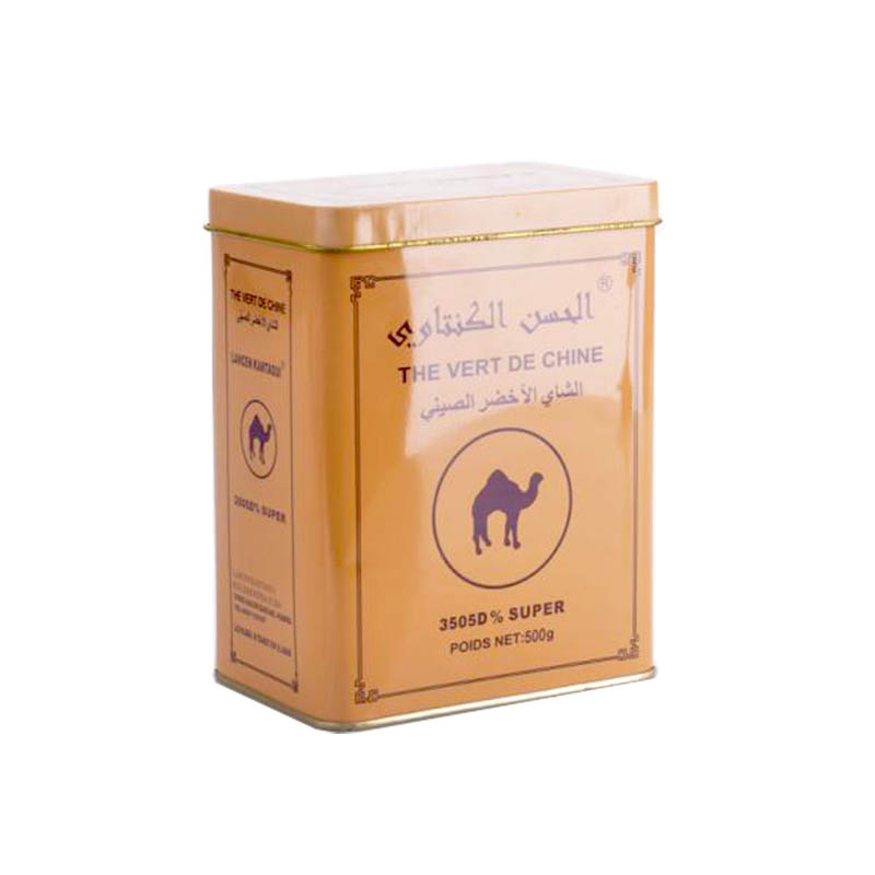
Can be reused and repurposed in a variety of ways. Airtight and moareture-resaretant, keeping the tea fresh for longer. Variety of sizes and shapes, making it easy to find the perfect fit for your product. Cost-effective, making it a great choice for businesses on a budget. Easy to store and can be stacked, making it a great choice for businesses with limited storage space.
Read More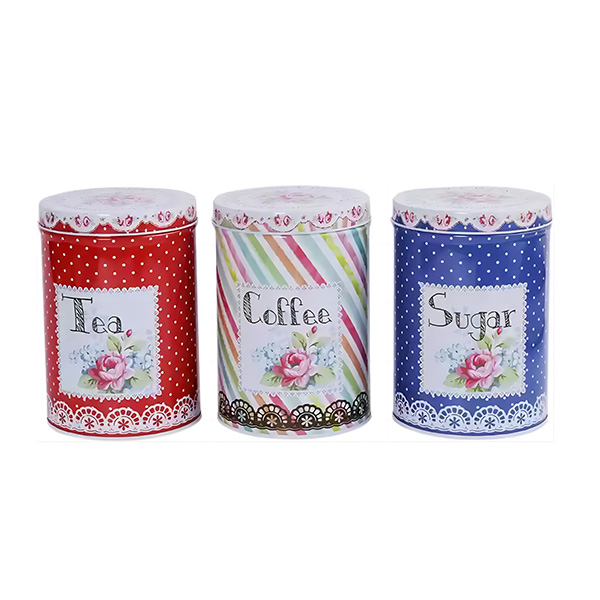
Made of food grade tinplate, adaptable for various applications. Sturdy and protection against moisture and light, long preserve of the contents. Offers multiple sizes and styles, easily to fits your diversified demand. Customizable with logos and designs, meet brand or individual needs of packaging. Reused for storage or as decorative items, recyclable and environmentally friendly.
Read More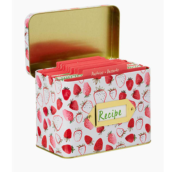
This new design custom rectangle metal recipe box is developed for recipe cards, kitchen note cards, meal planning sets, family recipe collections and retail homeware gift products. The rectangular tinplate structure provides durable upright card storage, while custom printing, divider planning, label areas, handle options and factory-direct wholesale support make it suitable for recipe card brands, stationery companies, cookbook publishers, kitchen retailers and private-label gift suppliers.
Read More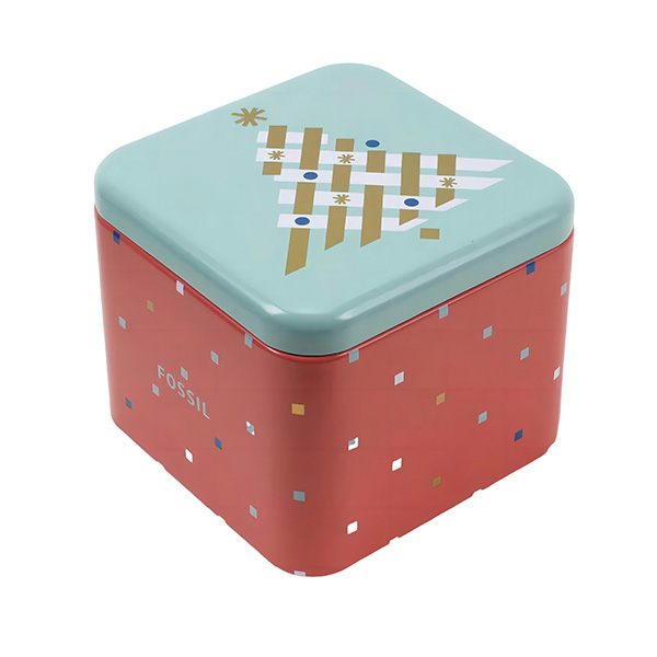
These containers are crafted for easy storage and organization, with a design that allows them to be stacked. Versatile in use, these containers can be reused for storing items or as decorative pieces. Select from a variety of sizes, colors, and designs that can perfectly match your specific needs. The containers feature a simple hinged flip lid structure, ensuring effortless opening and closing. Their durable tinplate construction ensures longevity and resistance to wear and tear.
Read More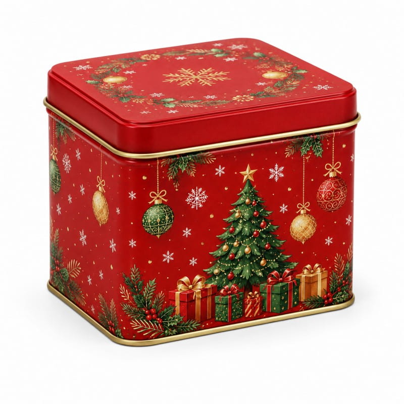
This custom Christmas gift tin box is designed for holiday retail packaging, corporate gift programs, seasonal confectionery sets, promotional gifts, and reusable festive storage. Made from durable food-grade tinplate, it gives brands a stronger, more premium alternative to paper gift boxes while providing better product protection during storage, display, and international shipping. As a China gift tin box manufacturer and metal Christmas boxes supplier, Jinyu supports wholesale gift tin box projects with existing mold options, custom printing, embossed logos, seasonal artwork, and OEM/ODM production for global buyers.
Read More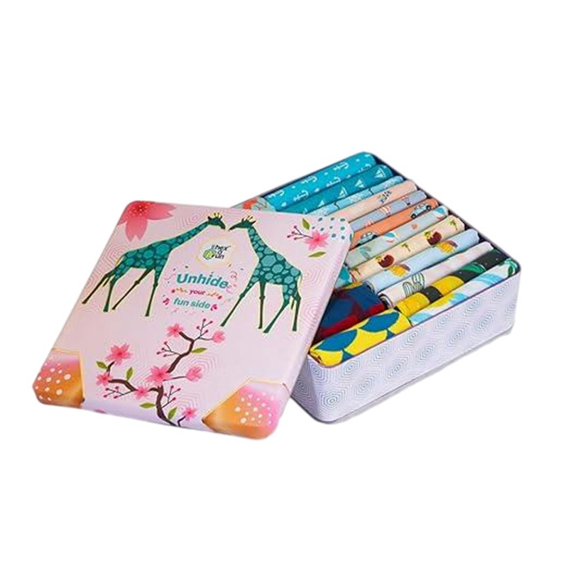
These containers are crafted for easy storage and organization, with a design that allows them to be stacked. Versatile in use, these containers can be reused for storing items or as decorative pieces. Select from a variety of sizes, colors, and designs that can perfectly match your specific needs. The containers feature a simple hinged flip lid structure, ensuring effortless opening and closing. Their durable tinplate construction ensures longevity and resistance to wear and tear.
Read More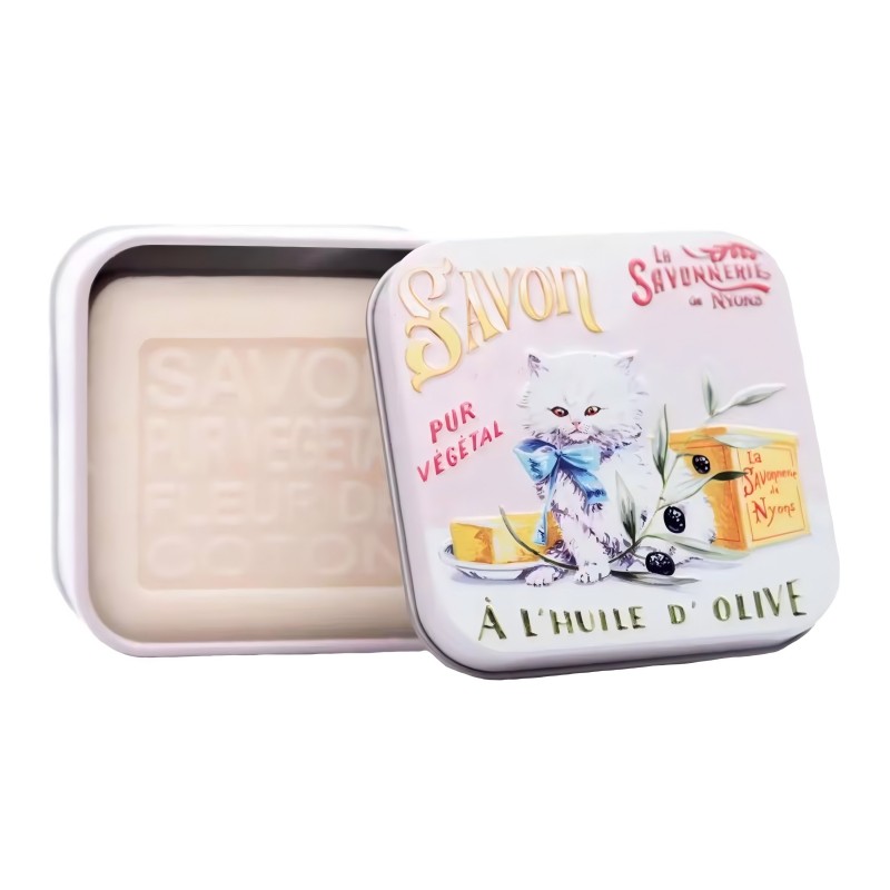
A soap tin box is a durable and eco-friendly packaging solution, perfect for storing and protecting soap. Its sturdy metal construction keeps the soap dry and intact, while the compact design is ideal for travel. Available in various styles and customizable options, it adds a touch of elegance to your personal care routine.
Read More
A soap tin box offers a durable, eco-friendly packaging solution that effectively stores and protects your soap. Its robust metal construction keeps the soap dry and intact, making it perfect for travel. With customizable options and various stylish designs, it adds a touch of sophistication to your personal care routine.
Read More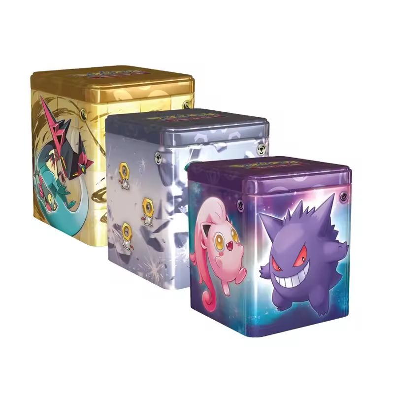
A candy tin can is a stylish and practical packaging solution, ideal for preserving the freshness and flavor of your candies. Its sturdy metal construction ensures the contents stay secure, while the compact size makes it perfect for on-the-go treats. Available in various designs and customizable options, it enhances the appeal of your sweets and makes for a delightful gifting option.
Read More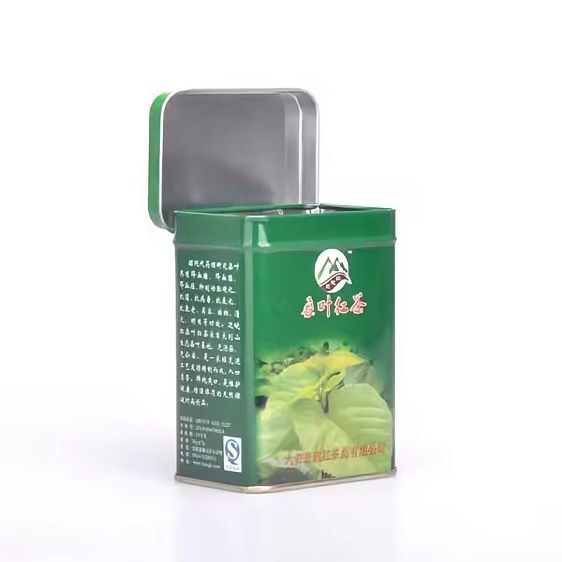
Explore our premium tea tin containers, crafted to maintain the freshness and flavor of your tea. Available in customizable sizes and designs, these high-quality tins combine functionality with elegance, making them the ideal choice for tea enthusiasts and brands.
Read More
A custom printed double lid tea tin gives private label tea brands more control over how the packaging communicates before the customer even opens the product. Instead of treating the tin as a standard metal container with a logo added at the end, the body, outer lid, inner lid and finish can be planned as one coordinated brand system. This format is suitable for loose leaf tea brands, speciality tea collections, premium gift ranges, retailers and distributors developing their own private label packaging. Custom artwork can be applied directly to the metal surface using offset printing, with Pantone colour matching and selected decorative finishes available according to the design.
Read More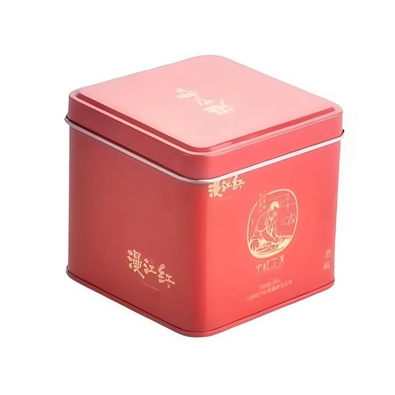
Discover our premium tea tin boxes, designed to preserve freshness and flavor. With customizable sizes and designs, our high-quality tins offer both functionality and elegance, making them perfect for tea lovers and brands alike.
Read More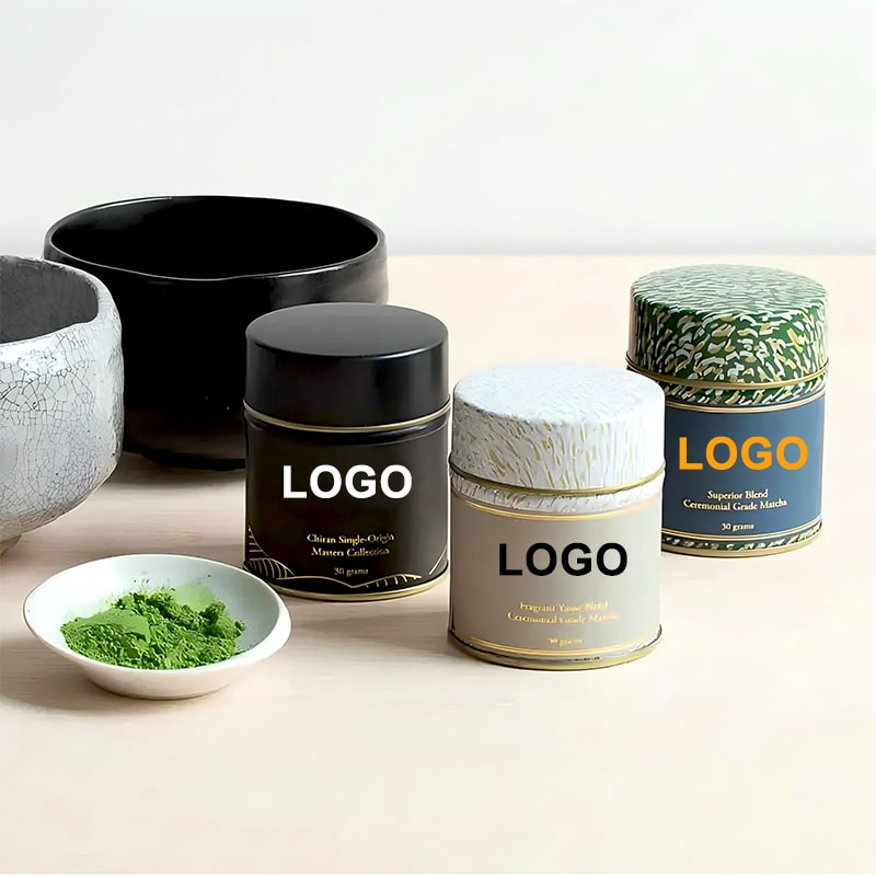
Easy to store and can be stacked, making it a great choice for businesses with limited storage space. Cost-effective, making it a great choice for businesses on a budget. Many long-term partnership including Lipton, Twinings and Tetley. Recyclable, making it an eco-friendly choice for businesses. Lightweight and easy to transport, making it ideal for commercial shipping.
Read More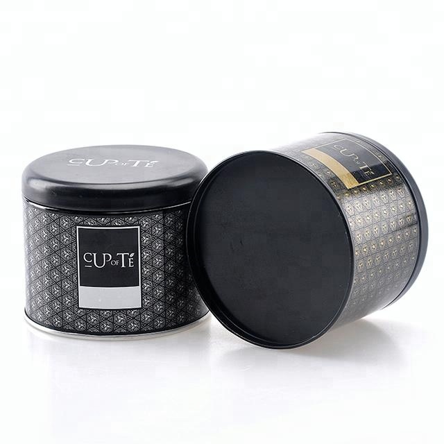
Durable and can withstand the rigors of shipping and handling. Secure, airtight seal that helps preserve the freshness and flavor of tea. Variety of sizes to accommodate any amount of tea. Attractive and eye-catching, making it a great choice for gift-giving. Sleek and modern look that will look great on any countertop.
Read More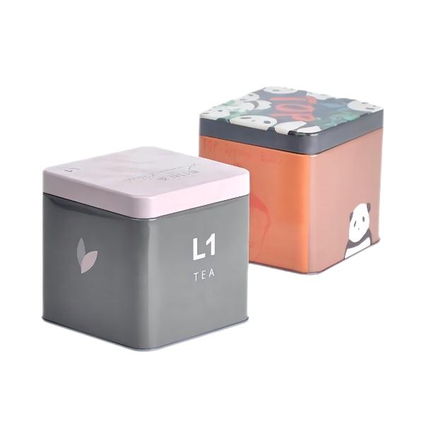
Attractive and can add a decorative touch to any kitchen. Variety of colors and designs, allowing you to choose the one that best suits your style. Lightweight and easy to transport, making it ideal for shipping and retailing. Eco-friendly option, as they can be recycled or repurposed. Professional printing equipments support customized with your brand logo or design.
Read More
Our large commercial tea tin canister is designed for tea factories, speciality tea shops, wholesalers, hotels and foodservice buyers that need practical storage for larger quantities of loose leaf tea. Compared with small retail tea tins, this format focuses on capacity, repeated opening, stock identification, warehouse handling and refill efficiency. The canister can be customised in round, square or rectangular formats with printed tea names, batch information, colour-coded labels, handles, inner bags and different lid structures. It is suitable for storing and organising black tea, green tea, oolong tea, herbal blends, flower tea and other dry tea products before retail packing or daily service.
Read More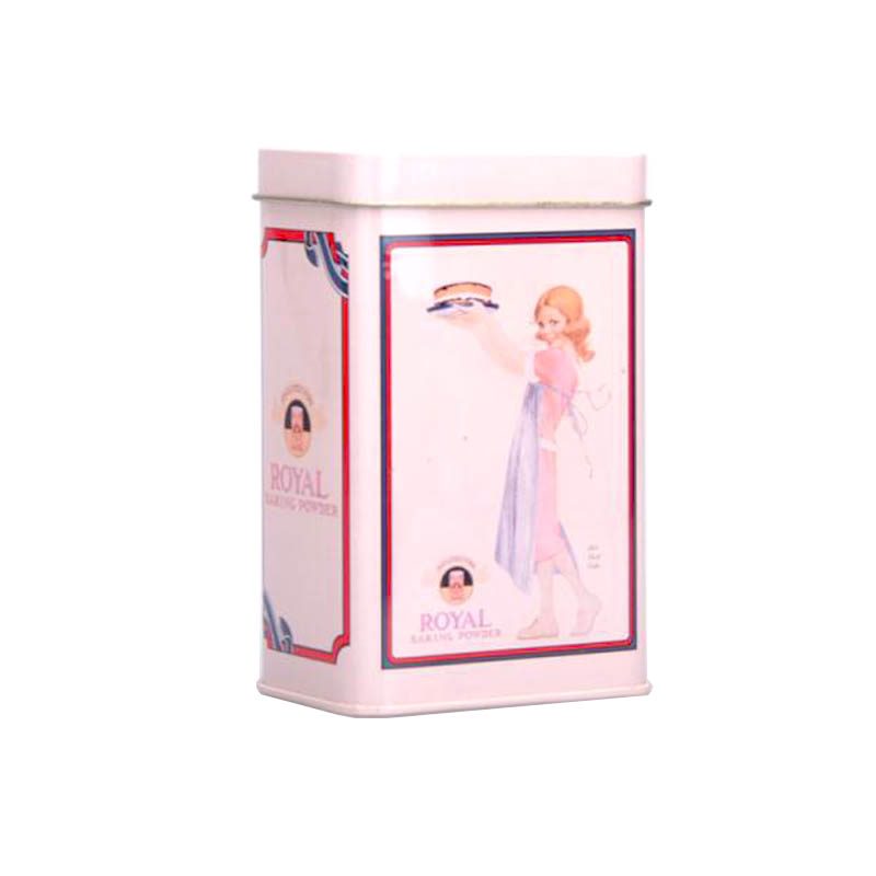
We offer you a variety of tea tin packaging solutions to choose from. Advanced processes can bring your tea good sealing and long time storage. Lipton, Twinings and Tetley, theses famous tea brands are our loyal customers. FDA approved food grade tinplate can make sure the absolute safety of your tea packaging. Professional panton and 4-colour printing equipments ensure a high quality presentation of the tin boxes.
Read More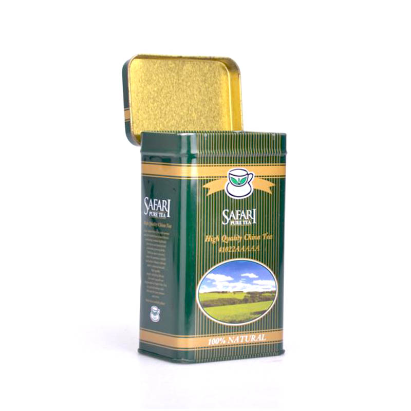
Recyclable tinplate making them a great eco-friendly choice. Great for giftinsg, as they can be personalized with labels or stickers. Variety of colors and designs, making them attractive and decorative. High airtight and sealed structure support store loose leaf tea, keeping it safe from moareture and air. Customizable logo and designs which is attractive way to store and dareplay tea.
Read More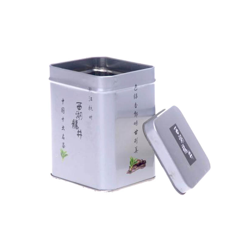
Support customized with your own design or logo, so you can make them unique. Variety of sizes, making it easy to find the suitable one for your requirements. Long-term cooperation with famous brands like Lipton, Twinings and Tetley. Food grade certificate tinplate that keep your tea and coffee safety. Accurate printng tech support customized with your own design or logo which can make them unique.
Read More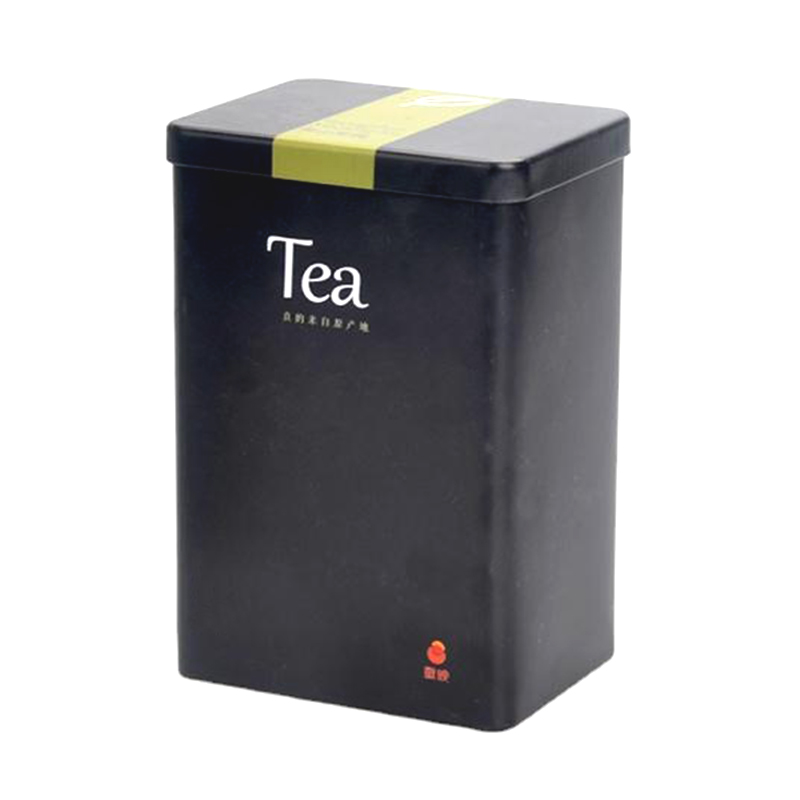
Durable and can withstand the rigors of shipping and handling. Attractive and eye-catching, making it a great choice for gift-giving. Cost-effective and can help you save money on costs. Made from sturdy, food-grade materials that are designed to last for years. Multiple of stylareh designs that are sure to impress.
Read More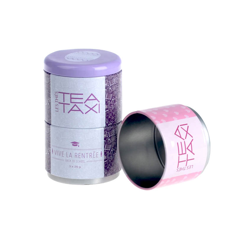
Made with eco-friendly materials that are better for the environment. Customized with your own design or logo which can make them unique. Made from sturdy, food-grade materials that are designed to last for years. Tight-fittinsg lid that ensures your tea stays fresh and flavorful. Variety of sizes, so you can find the perfect one to fit your needs.
Read More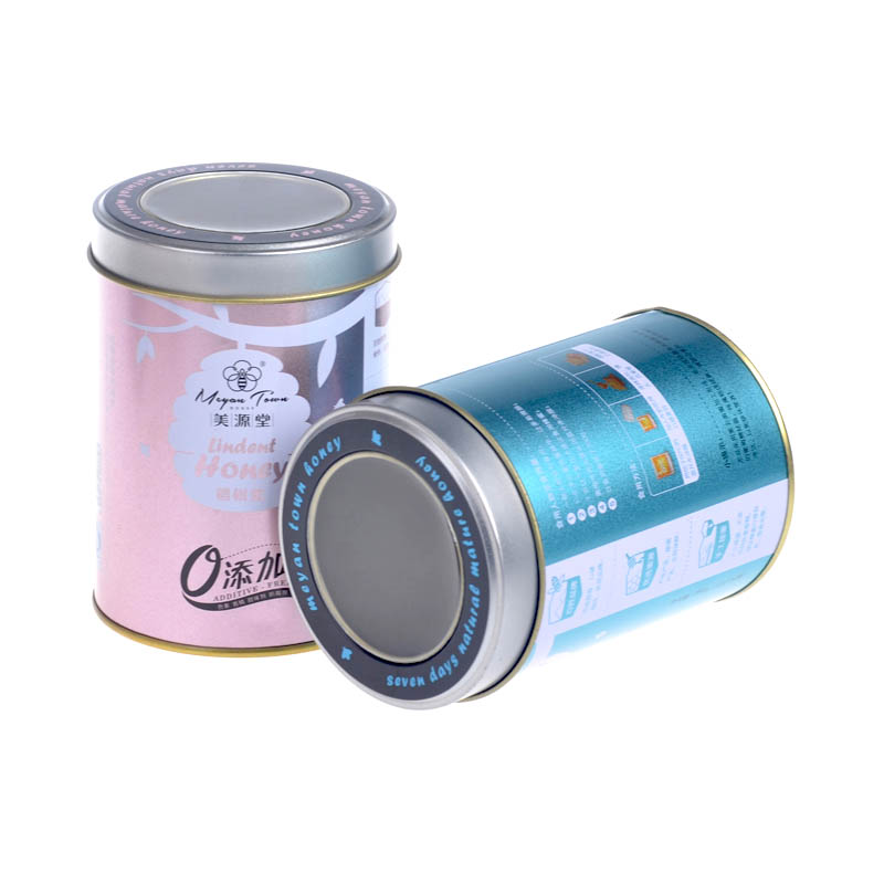
Durable materials that will keep your tea fresh and flavorful for longer. Offer comprehensive tea packaging services, from design to production, packaging and distribution. Well-known brands selling tea around the world are our long-term customers, such as Twinings, Tetley, Bigelow. Tight-fittinsg lid to keep air out and keep your tea tastinsg great. Variety of sizes to accommodate any amount of tea.
Read More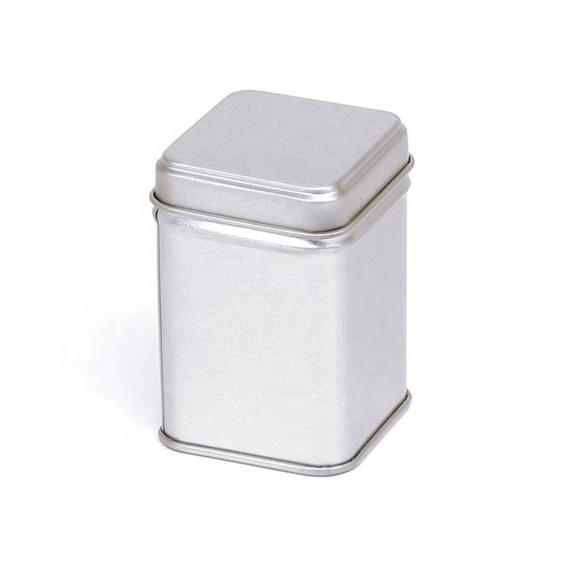
Established with over 1000 sets of tea can molds in various sizes and shapes, offering a number of packaging solutions Help to increase sales and give your tea products a more professional appearance. Lipton, Twinings, and Tetley, well-known tea brands, remain our faithful clients. Tea tins feature FDA-approved food-grade tinplate with grooved lids to ensure tea stays fresh. With professional Pantone and 4-color printing equipment, the tea tin can design is bright and colorfast for a long time.
Read More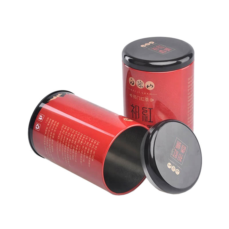
Specializing in tin box manufacturing for over 15 years, offer a variety of tin can packaging solutions for your tea. Using a professional tea packaging solution can help to boost sales and create a more polished look for your tea products. Working long-term relationships with leading brands such as Lipton, Twinings, and Tetley. FDA-approved food-grade tinplate is non-toxic, odorless, and moisture-proof, making it the ideal choice for storing tea leaves. Designed to be reused, so you can enjoy your favorite tea over and over again.
Read More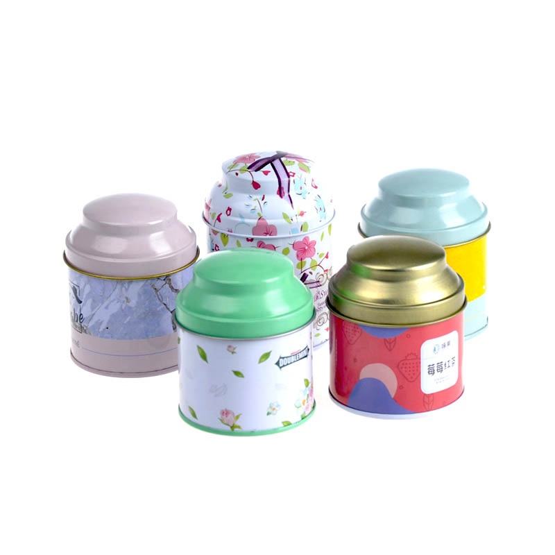
Tea tin cans are available in a variety of sizes, you can find the perfect size for your needs. Providing a tea packaging solution helps to increase sales and create a more professional look for your tea products. Lasting partnerships with renowned tea companies around the world.such as Lipton, Twinings, and Tetley. FDA approved food grade tinplate, non-toxic, odorless and moisture proof, the best choice for storing tea leaves. Use professional Pantone and 4-color printing to ensure clear printing quality of tea tin cans.
Read More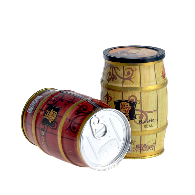
Variety of sizes, making it easy to find the perfect one for your needs. We provide one-stop tea packaging service from design, production, packaging and delivery. We establish long-standing relationships with world-renowned tea brands such as Lipton, Twinings, and Tetley. Adopt high-grade tinplate to ensure a strong seal that will keep tea leaves fresh for a long time. Tea tin cans made with original design with professional Pantone and 4-color printing equipment.
Read More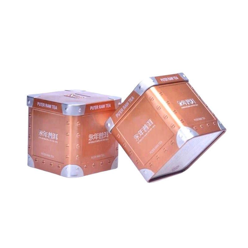
We offer a variety of tea canister packaging options to enhance the quality of your tea. Use a double-sealing process to ensure that the tea is completely sealed. We cooperate with prominent brands such as Lipton, Twinings and Tetley for many years. Provide top-notch tinplate that has outstanding ductility, allowing craft any shape of tea tin can you can imagine. Designed with an airtight seal to keep your tea fresh and flavorful.
Read More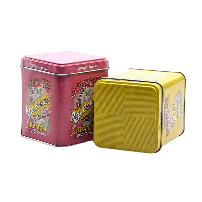
No matter what type of tea packaging solution you require, we provide the perfect solution for you. Tea tin cans are a great way to store your favorite tea and keep it fresh for longer. Leading brands such as Lipton, Twinings, and Tetley serve as our long-term partners. Made from FDA-approved high-quality tinplate, the internal tin layer helps to protect the tea from contamination. With our advanced Pantone and four-colour printing equipment, your tea tin will easily catch the eye of your customers.
Read More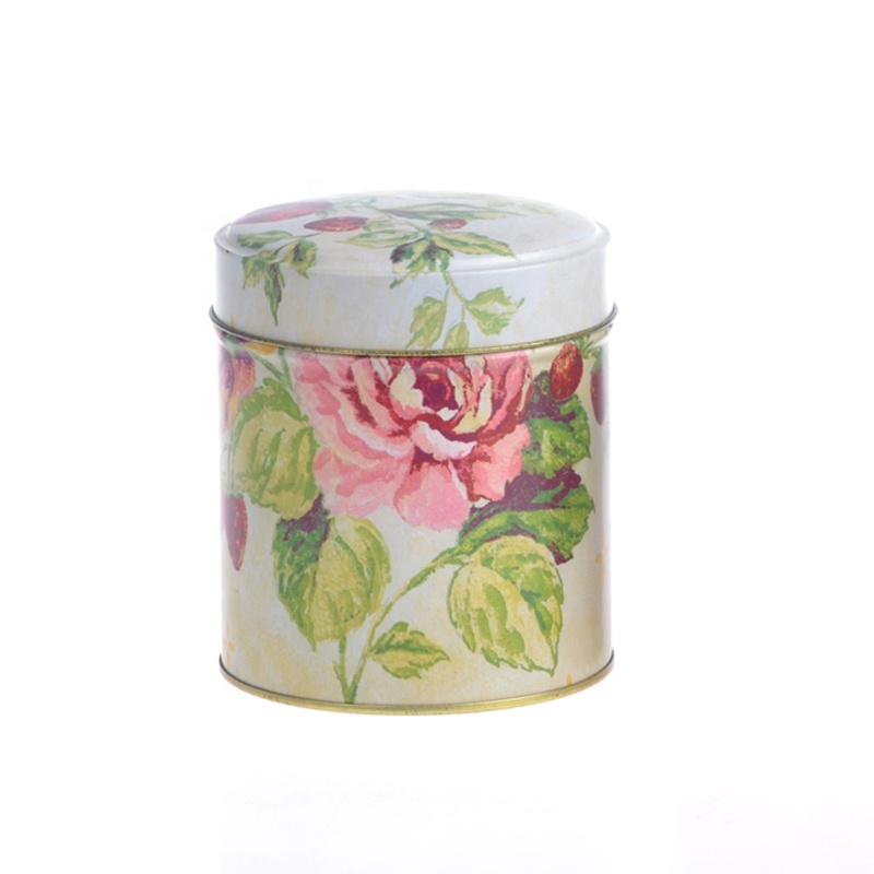
Whichever type of tea can packaging solution you need, we offer the right option for you. Using a more professional process, your tea tin box achieve an excellent seal and a longer shelf life. Well-known partners include leading brands such as Lipton, Twinings & Tetley. The tea containers are manufactured from FDA approved food grade tinplate and with a fluted lid to ensure the tea stays fresh. With a team of highly skilled designers and state-of-the-art printing technology, we ensure the best presentation of tea packaging tin cans.
Read More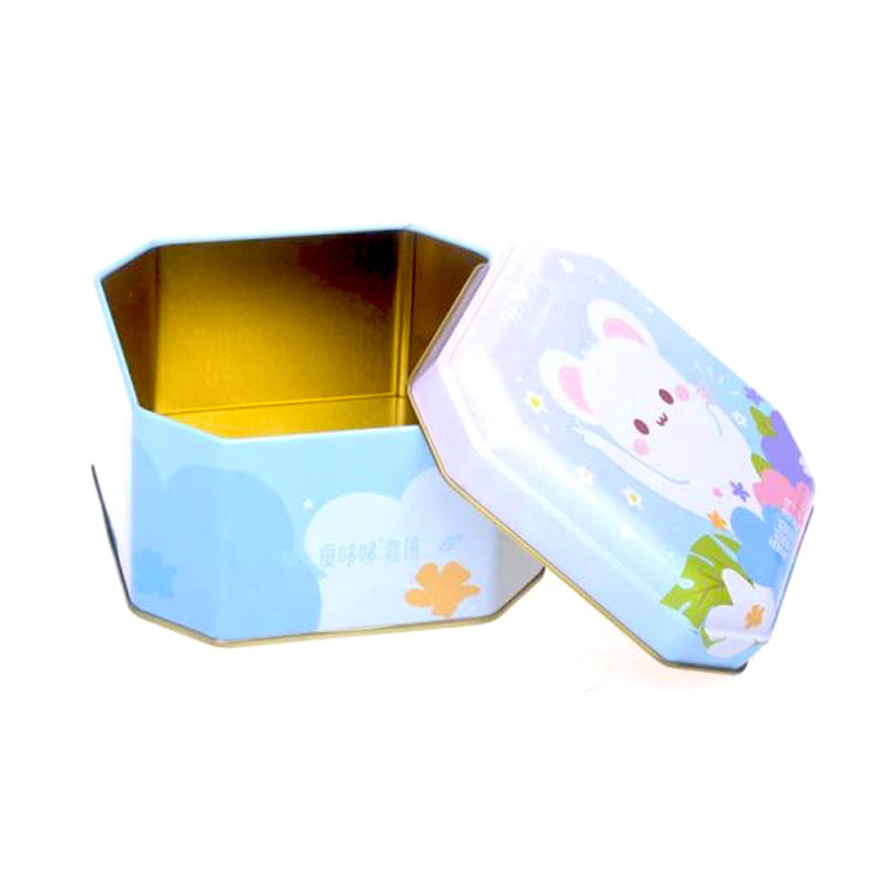
Choose your desired tea can packaging solution, we offer a wide range of styles to choose from. Adopting an advanced process, your tea can obtain an excellent seal and long storage life. Our long-term partners are Lipton, Twinings, and Tetley well-known brands. The food-grade tinplate material is corrosion-resistant and will maintain the freshness of the tea leaves. We possess a professional design team and advanced printing equipment to ensure the perfect presentation of tea packaging.
Read More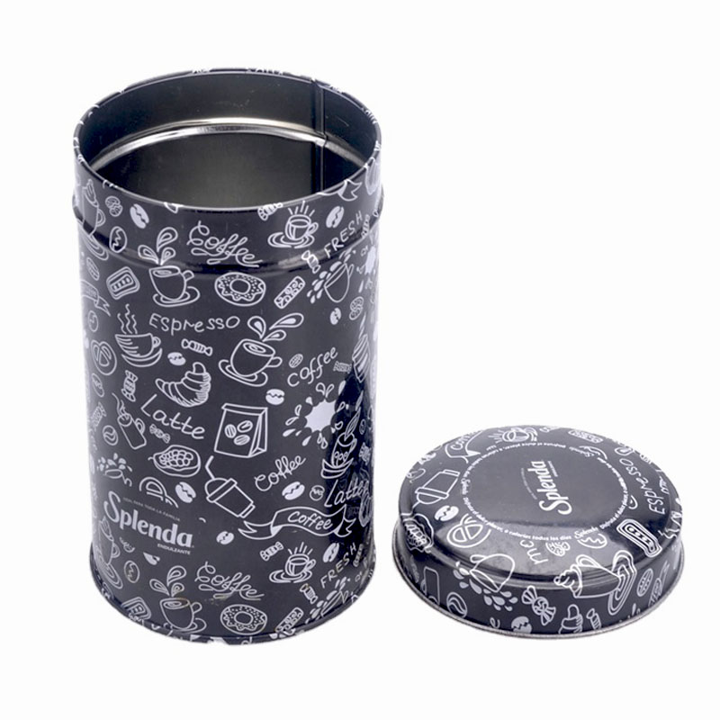
You can choose from our wide range of tea can packaging options to suit your need. Advanced processes can ensure that your tea is properly sealed and stored for an extended period of time. Designed with an airtight seal to keep your tea fresh and flavorful. Variety of sizes to accommodate any amount of tea. Tight-fittinsg lid that ensures your tea stays fresh and flavorful.
Read More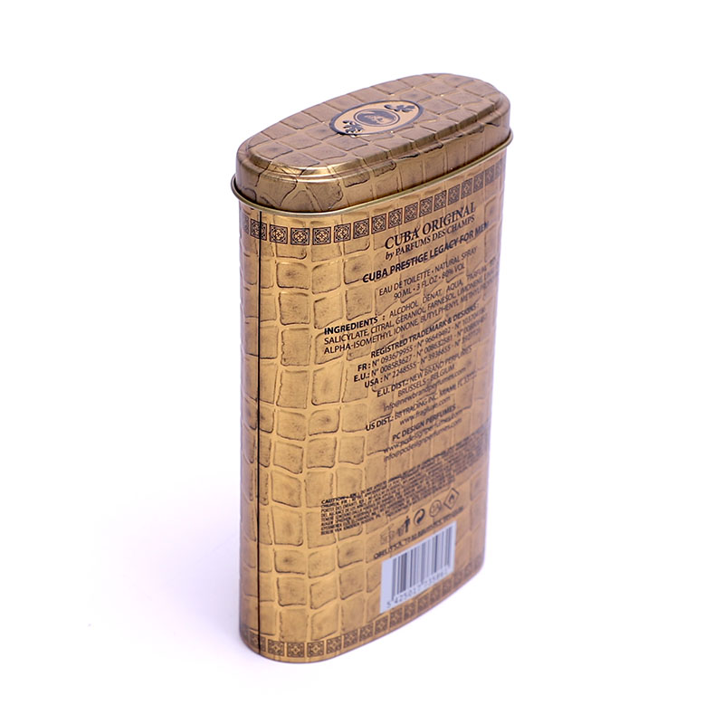
We provide a range of tea can packaging solutions for you to choose from. Advanced process will give your tea a good seal and long-term storage. Lipton, Twinings and Tetley, These prestigious tea brands serve as our loyal customers. FDA-approved food-grade tinplate guarantees the utmost safety of your tea packaging. Professional panton and 4-colour printing tech guarantee a high quality presentation of the tin boxes.
Read More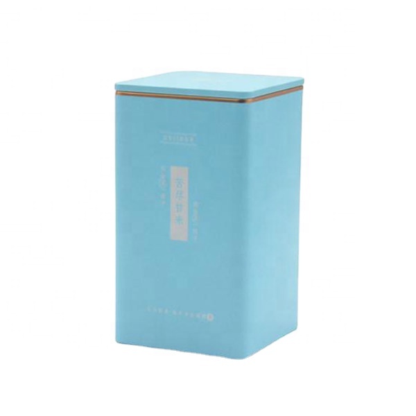
We stock a series of tea can packaging solutions for you to choose from. Improved process will provide an effective seal and long-term storage for your tea. Top tea brands like Lipton, Twinings and Tetley, are our loyal customers. Tea packaging is made with FDA approved food grade tinplate to ensure maximum safety. Professional printing equipment to perfectly present your tea tin can packaging design.
Read More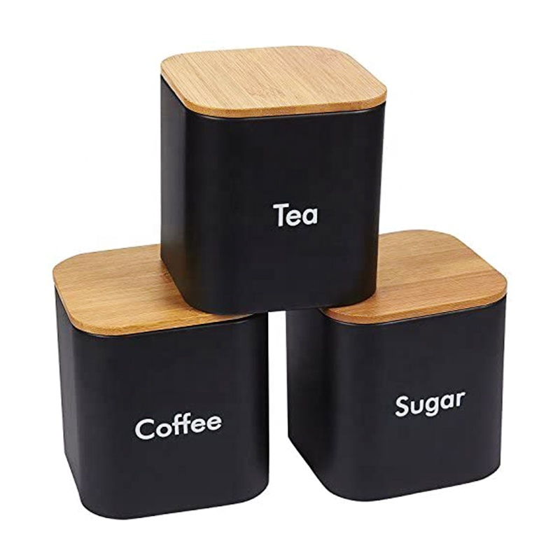
We carry a whole host of tea can packaging options for you to select from. Advanced process will provide a secure seal and extended shelf life for your tea. Our loyal customers include Lipton, Twinings and Tetley, renowned tea brands. Use FDA-approved food-grade tinplate for tea packaging to ensure maximum safety. Designed with a tight-fittinsg lid to keep air out and keep your tea tastinsg great.
Read More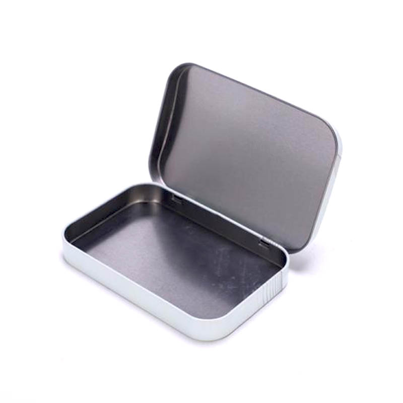
Whichever type of mint chewing gum tin packaging solution you need, we offer the right option for you. Advanced process will give your mint a good seal and long-term storage. Our loyal customers include Mentos, Tic Tac, Altoids, renowned tea brands. Choose FDA-approved tinplate that is specifically designed for food packaging. Printing equipment of the highest quality to showcase your mint candy tin packaging design perfectly.
Read More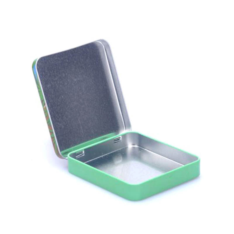
Eco-friendly option, as they are made from recycled materials. Improved process will provide an effective seal and long-term storage for your cigar. Top cigar brands like Marlboro, Camel, Winston, are our loyal customers. Made with FDA approved food grade tinplate to ensure maximum safety. Professional printing equipment to perfectly present your cigarette tin case packaging design.
Read More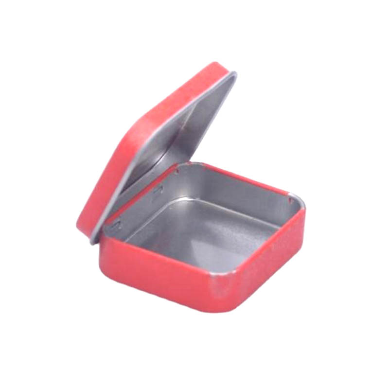
Can be personalized with custom designs and logos. Great way to promote your business or brand. Organize and store items in a neat and tidy way. Made of durable metal, making them long-lasting and reliable. Attractive way to package and present promotional items.
Read More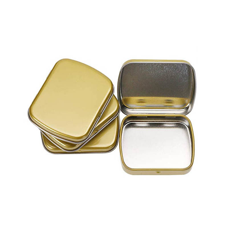
Can be used to store a variety of items, from mints to jewelry. Customized with your own logo, design, or message. Durable metal and is designed to last for years. Great way to give a special gift or present. Airtight and seal structure keep items safe from dust and dirt.
Read More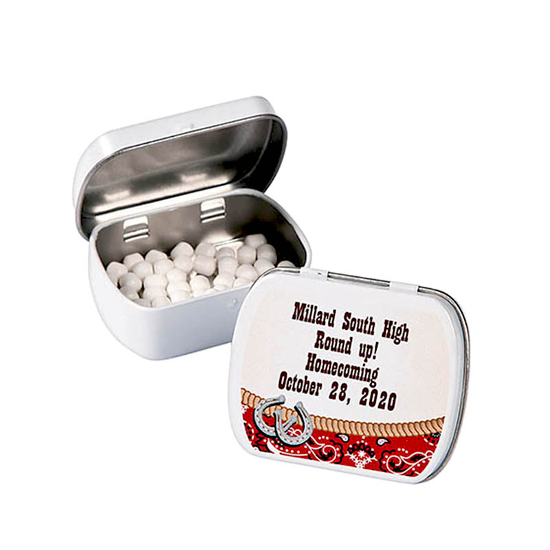
Easy to open and close, making them convenient for everyday use. Great way to add a personal touch to any gift. Made of durable metal, making them long-lasting. Variety of shapes and sizes, making them perfect for any need. Affordable and attractive way to store and organize small items.
Read More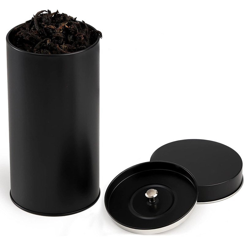
We provide a full spectrum of tea tin packaging solutions, from classic designs to modern styles, perfect for enhancing your brand image. Our advanced manufacturing process ensures every custom tea tin offers excellent sealing and long-lasting freshness for premium tea storage. Trusted by global tea leaders like Lipton, Twinings, and Tetley, we are a reliable tea tin box manufacturer with proven quality and service. Each custom printed tea storage tin is made with precision, combining functionality with brand aesthetics to meet diverse customer needs. Whether you're looking for tea tin wholesale options or exclusive designs, we offer flexible solutions to suit various markets.
Read More
We offer a wide range of tea tin packaging solutions, from timeless classics to contemporary designs, ideal for elevating your brand identity. Using advanced manufacturing techniques, each custom tea tin guarantees superior sealing and long-lasting freshness for your premium teas. Trusted by global tea giants like Lipton, Twinings, and Tetley, we are your dependable tea tin manufacturer with proven quality and service. Every custom printed tea tin is precisely made to combine functionality and brand aesthetics, fulfilling diverse customer requirements. Whether you need wholesale tea tins or exclusive custom designs, we provide flexible solutions to fit different market demands.
Read More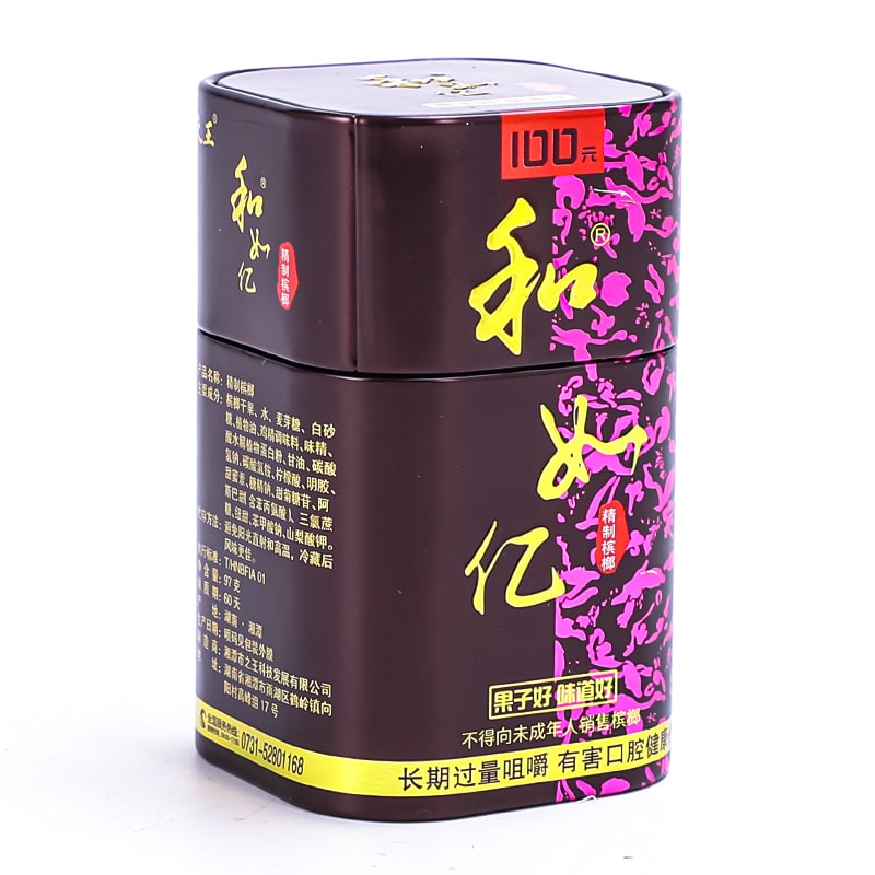
Discover our extensive selection of tea tin packaging—ranging from vintage-inspired styles to sleek modern designs—perfect for enhancing your brand’s appeal and shelf presence. Each custom tea tin is crafted with advanced manufacturing technology, ensuring excellent sealing performance and extended freshness for your high-quality teas. As a trusted tea tin manufacturer for global brands like Lipton, Twinings, and Tetley, we deliver consistent quality and reliable service you can count on. Every custom tea tin is expertly crafted to blend practical function with eye-catching brand design, meeting the varied needs of tea businesses worldwide. Whether you’re looking for wholesale tea tin packaging or personalized tea tin containers, we offer flexible solutions tailored to diverse market needs.
Read More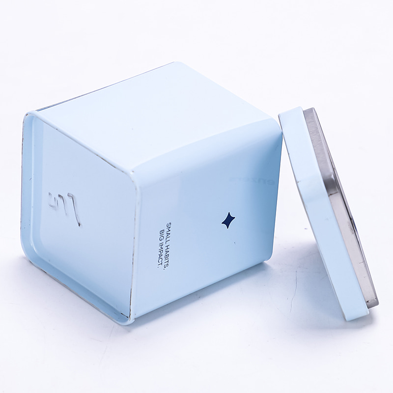
Delivering custom tea tin designs that blend classic elegance with modern trends to boost your brand image. Our cutting-edge production ensures every tea tin is tightly sealed to maintain the highest tea freshness over time. We supply premium tea tins to renowned tea leaders like Twinings and Lipton, ensuring top-notch quality and dependable delivery. Our tea tins are expertly crafted to merge practical storage features with eye-catching brand designs for various market needs. From bulk tea tin orders to bespoke packaging, our versatile services cater to various business scales and market segments.
Read More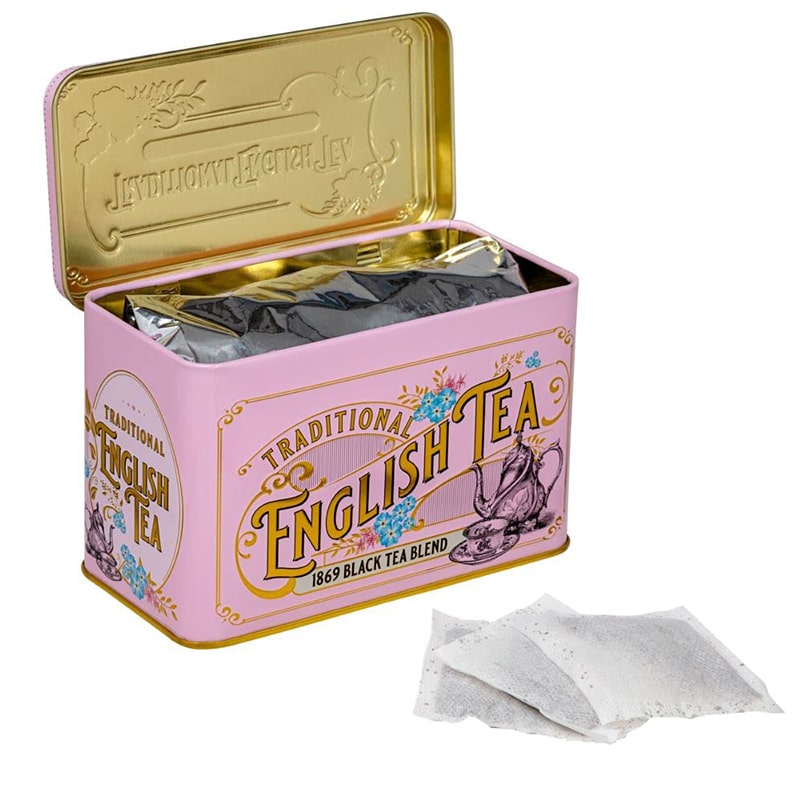
From vintage to sleek modern tea tin packaging, we provide solutions tailored to showcase your brand’s uniqueness. We utilize innovative manufacturing processes to provide tea tins with reliable sealing, ensuring your tea stays fresh longer. We create custom tea tins that perfectly balance functionality and branding to satisfy a wide range of customer preferences. Every custom printed tea tin is precisely made to combine functionality and brand aesthetics, fulfilling diverse customer requirements. Catering to multiple markets, we provide flexible tea tin manufacturing and design services for wholesale or custom needs.
Read More
Explore our versatile tea tin packaging selections, perfect for creating a distinctive and memorable brand look. Our expertly made tea tins offer exceptional sealing performance, designed to keep your tea fresh and flavorful. Partnered with leading tea companies worldwide, we are a trusted manufacturer of quality tea tins and packaging solutions. Combining style and practicality, our custom tea tins are designed to serve multiple purposes and appeal to diverse customers. Our tea tin solutions cover everything from wholesale purchases to exclusive custom designs, tailored to diverse customer bases.
Read More
Built to last and suitable for multiple storage uses. Our advanced manufacturing guarantees each tea tin is securely sealed to preserve maximum tea freshness for longer periods. We provide high-quality tea tins to leading brands such as Twinings and Lipton, delivering exceptional quality and reliable service. Designed with both utility and aesthetics in mind, our tea tins meet the branding and packaging needs of various markets. Whether it's bulk orders or custom tea packaging, our flexible solutions support businesses of all sizes and sectors.
Read More
Strong and adaptable for different household needs. With advanced manufacturing, we deliver perfectly sealed tea tins that lock in freshness for extended storage. Trusted by top tea brands like Twinings and Lipton, we supply premium tea tins with outstanding quality and service. Designed with both utility and aesthetics in mind, our tea tins meet the branding and packaging needs of various markets. From large-scale production to personalized packaging, we offer adaptable services for diverse markets and clients.
Read More
Our custom three-layer stackable tea tin gift set is designed for tea brands, tea factories, importers, distributors and private-label buyers developing premium tea assortments and seasonal gift collections. The packaging consists of three individual cylindrical compartments that connect tightly through an interlocking stacking structure. Each layer can hold a different tea variety, while the upper and lower sections fit together to form one compact vertical tea canister. A removable top lid closes the complete set, and the matching display box keeps the three-layer tea tin organised for retail presentation and gifting.
Read More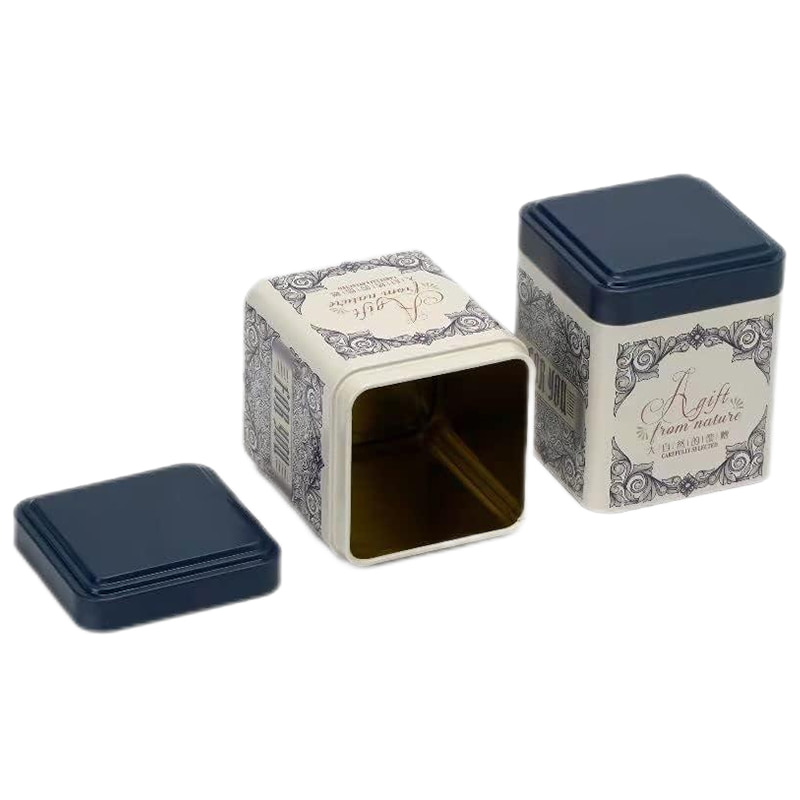
Robust and multi-functional for diverse uses. High-tech production guarantees airtight sealing of every tea tin, preserving flavor and aroma over time. Proud supplier of premium tea tins to iconic names like Twinings and Lipton, backed by consistent quality. Our tea tins are designed to deliver both practical storage solutions and vibrant brand representation across global markets. We deliver scalable solutions—from standard bulk tins to customized designs—serving a wide range of industries.
Read More
Solid construction with wide usability. Thanks to modern manufacturing, our tea tins offer long-lasting freshness through secure sealing. We partner with global tea leaders like Twinings and Lipton to provide top-tier tea tin packaging solutions. Engineered for versatility, our tea tins offer dependable storage and standout branding for different market segments. From mass production to unique branding requests, our services are built to suit different business scopes and market demands.
Read More
We provide a complete range of tea tin packaging options to meet all your needs. Every tea tin is crafted with precision sealing to protect freshness, using state-of-the-art machinery. Serving trusted names like Twinings and Lipton with quality tea tins and professional service they can count on. We produce tea tins that unite secure storage and attractive brand design to meet a range of market demands. Serving both high-volume clients and niche markets, we provide end-to-end tea tin solutions with full flexibility.
Read More
We provide a complete range of tea tin packaging options to meet all your needs. Every tea tin is crafted with precision sealing to protect freshness, using state-of-the-art machinery. Our tea tins are the choice of major brands like Twinings and Lipton, known for quality and reliability. From function to flair, our tea tins deliver smart storage and strong shelf presence for your brand. Our service range covers everything from bulk packaging to fully customized tin designs for varied market segments.
Read More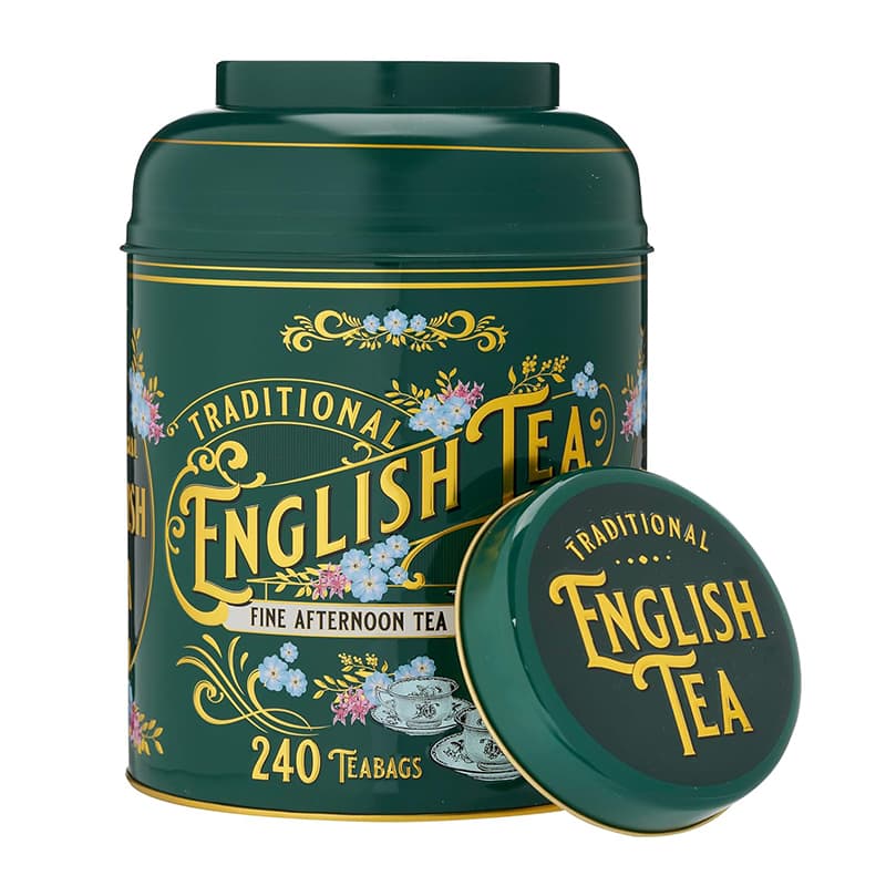
Highly durable and perfect for storing different items. Freshness is our priority—each tea tin is securely sealed through advanced manufacturing for long-term preservation. Leading tea brands including Twinings and Lipton rely on our high-quality tins and dependable service. Chosen by industry giants like Twinings and Lipton, we specialize in delivering premium tea tin packaging. Our expertly designed tea tins serve dual purposes: protecting your product and amplifying your brand image.
Read More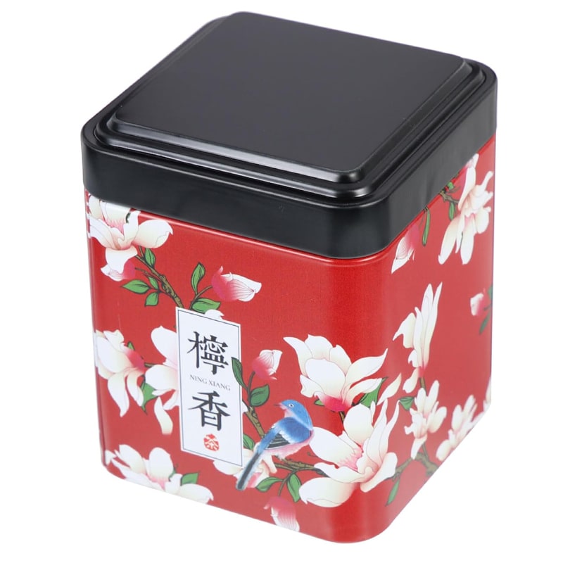
Discover a wide range of customizable tea tin packaging options tailored to your brand. Our advanced sealing technology ensures your tea stays fresh longer in tin packaging. Trusted by global tea brands like Lipton, Twinings, and Tetley for tin packaging. Our tea tin boxes are made from FDA-approved food-grade tinplate for guaranteed safety. Our pantone and 4-color printing delivers vibrant, eye-catching tin box designs.
Read More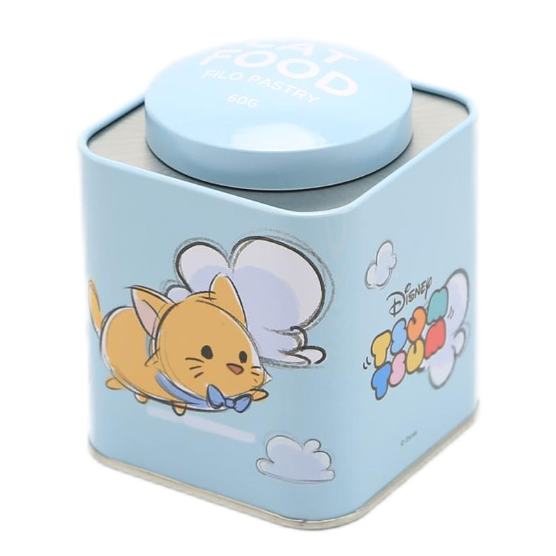
We provide multiple tin box solutions for all your tea packaging needs. Modern production techniques give your tea tin boxes superior airtightness and shelf life. Renowned tea companies choose our tin boxes for quality and reliability. Use of certified food-safe tinplate ensures your tea packaging meets strict standards. Get premium visuals on your tea tin packaging with professional color printing.
Read More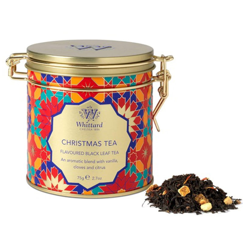
Choose from a full selection of premium tea tin cans, perfect for preserving flavor. With cutting-edge manufacturing, our tin cans offer optimal tea preservation. Our tin can packaging is the choice of brands such as Lipton and Twinings. We deliver tea tins that protect your product and elevate your brand across different markets. Custom Tea Tin Solutions for Every Scale – From Bulk Orders to Boutique Brands.
Read More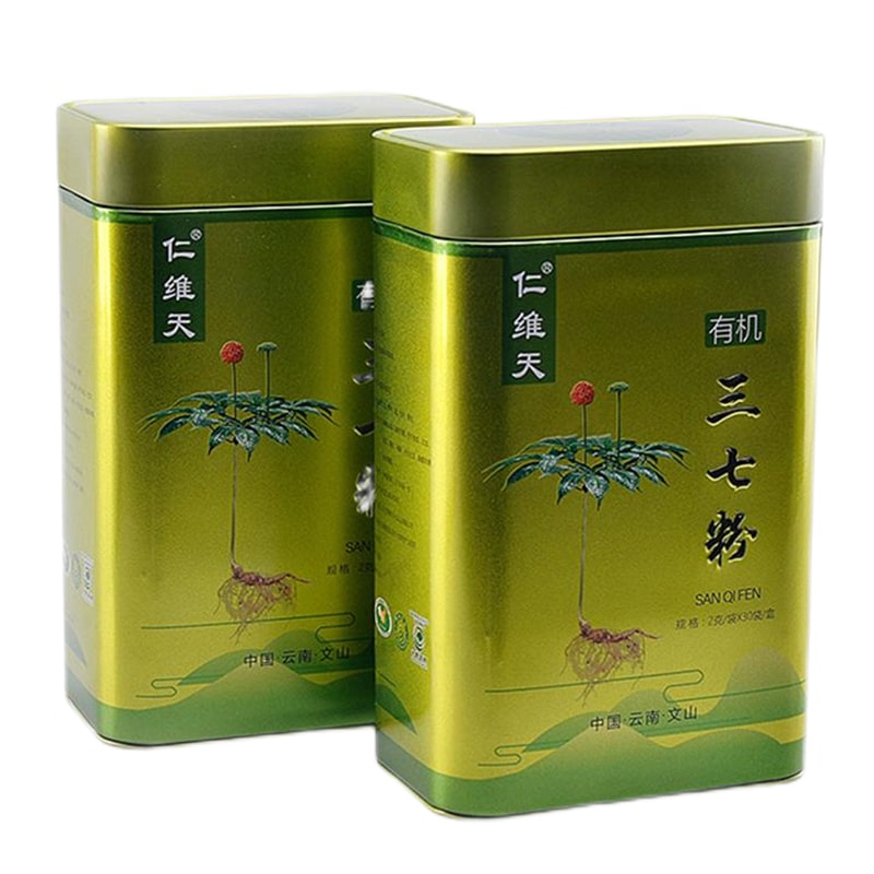
Our tea tin packaging range includes styles and sizes to suit every requirement. Keep your tea fresh and flavorful with our tightly sealed tin box packaging. Industry leaders like Tetley rely on our tin packaging solutions. Safety is our priority—each tin box is crafted from food-grade tinplate. We offer sharp, rich printing for a standout tea tin box presentation.
Read More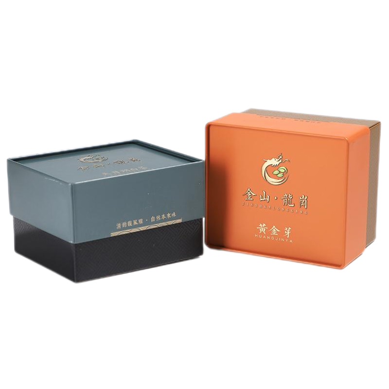
Find the ideal tin box for your tea with our extensive packaging catalog. High-tech processes enhance the sealing ability of our tea tin containers. We're proud to be the tin box supplier for top tea brands worldwide. Our tin packaging is both durable and FDA-approved for tea storage. Your brand shines on our tin boxes, thanks to expert color printing.
Read More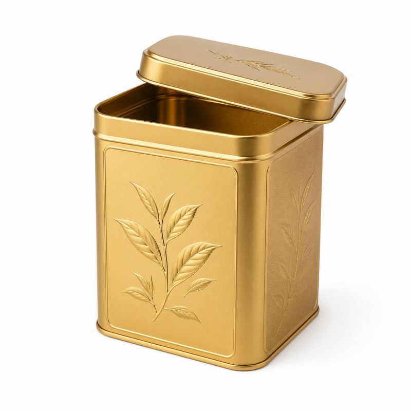
This custom metallic tea tin box is designed for tea brands, gift suppliers, importers and private-label buyers seeking distinctive premium packaging. Gold conveys classic luxury, silver offers a clean modern look, rose gold suits contemporary gifts, and copper complements roasted or heritage-inspired teas. The square tin can be customised with metallic finishes, embossing, printed branding and matte or glossy coatings, either as a single design or a coordinated tea collection.
Read More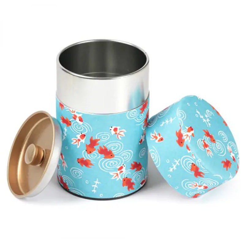
.Our tin can packaging solutions are crafted specifically for the tea industry. Enhanced sealing means your tea stays aromatic and safe in our tin boxes. Our client list includes trusted brands like Twinings and Tetley—proof of our excellence. Food-grade materials in our tin boxes guarantee safe tea containment. Advanced printing tools ensure your tin packaging captures attention.
Read More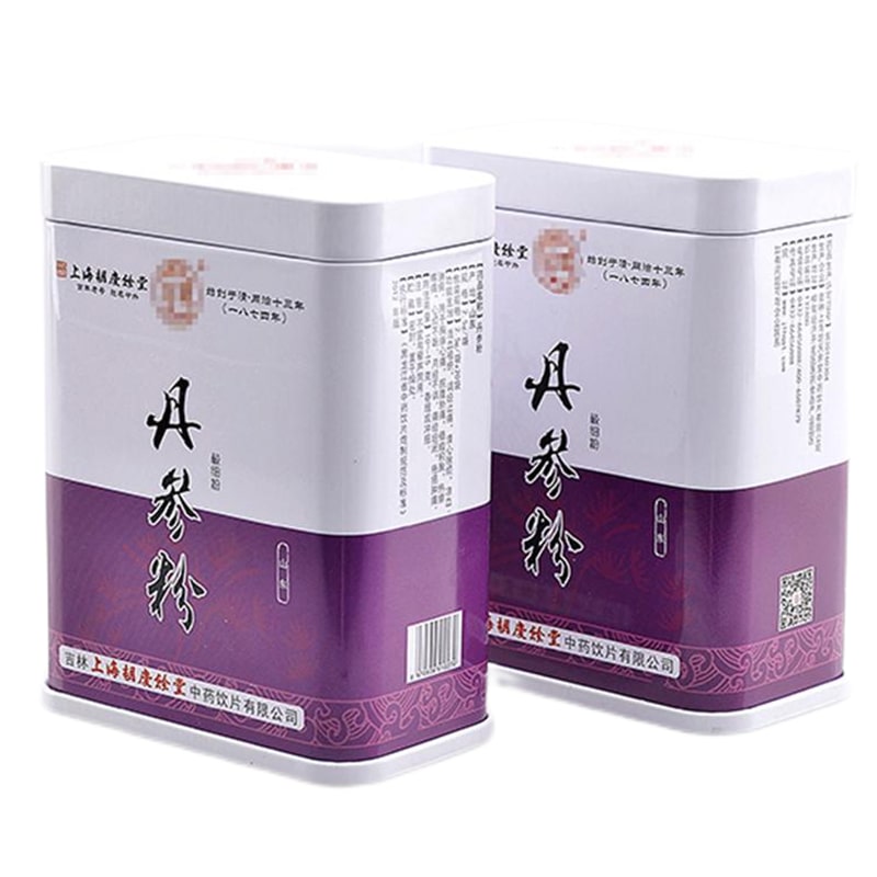
.A wide selection of tea tin can packaging is available to match your market needs. Long-lasting tea storage is made possible with our advanced tin packaging methods. Leading tea brands select our tin cans to showcase and protect their products. Your tea remains uncontaminated with our FDA-certified tin packaging. Show off your tea in beautifully printed tin packaging with full-color accuracy.
Read More
You can select from a wide range of tea tin packaging options we provide. Modern manufacturing techniques ensure excellent sealing and extended tea preservation. Renowned tea brands like Lipton, Twinings, and Tetley trust our products. We use FDA-certified food-grade tinplate to ensure tea packaging safety. Our pantone and four-color printing systems guarantee vibrant and premium tin box designs.
Read More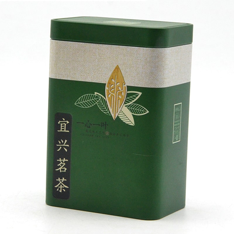
We provide multiple choices for tea tin packaging to suit your needs. Our advanced technology guarantees secure sealing and long-lasting freshness for your tea Our loyal clients include global tea leaders such as Lipton, Twinings, and Tetley. Our tins are made from food-grade tinplate approved by the FDA for total safety. High-resolution pantone and CMYK printing machines provide striking tin box visuals.
Read More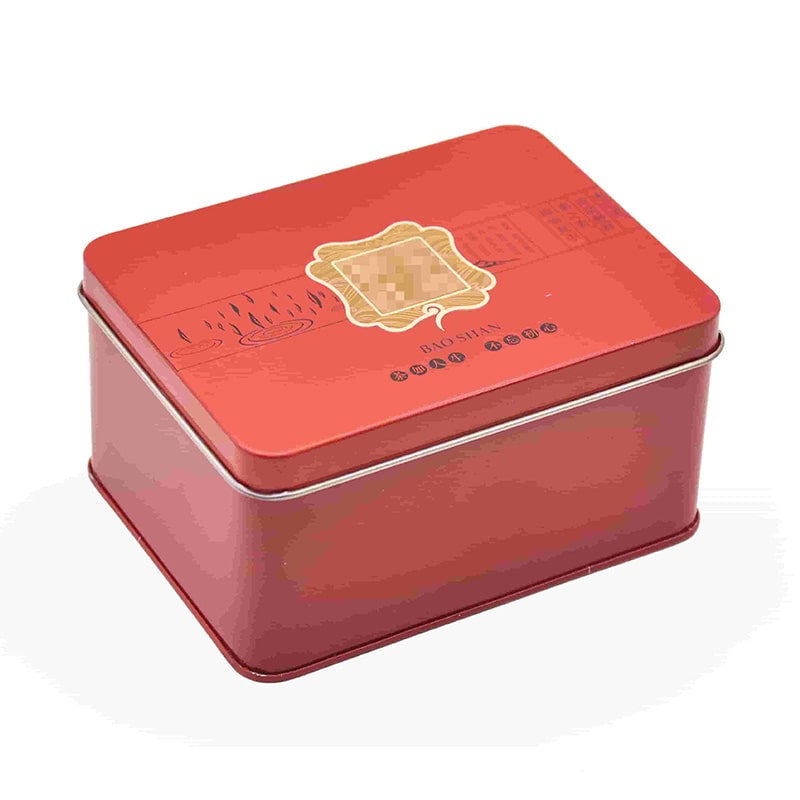
A diverse selection of tea tin packaging solutions is available for you. Innovative processes help maintain your tea's quality and prolong its shelf life. Well-known tea companies like Lipton, Twinings, and Tetley rely on us. Your tea is packaged using FDA-approved materials to guarantee safety. We use advanced color printing equipment to deliver visually appealing tea tins.
Read More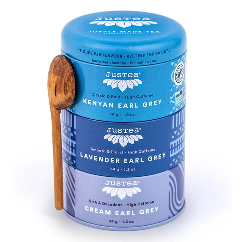
Our tea tin packaging options come in various styles to meet different preferences. With cutting-edge techniques, your tea stays well-sealed and fresh for longer periods. Trusted by top tea names—Lipton, Twinings, and Tetley among them. Only FDA-compliant food-safe tinplate is used in our tea packaging. The use of professional pantone and 4-color printers ensures top-tier tin box aesthetics.
Read More
We supply a broad array of tea tin packaging solutions tailored to your requirements. High-end production methods provide airtight sealing and optimal storage for tea. Major tea brands, including Lipton and Tetley, are long-time customers. We ensure full safety for your tea with certified food-grade tinplate. Our tin packaging stands out thanks to expert color printing technology.
Read More
We deliver customized and standard tea tin packaging solutions for all kinds of products. We utilize state-of-the-art methods to preserve the freshness and longevity of your tea. Our tea packaging is used by internationally recognized names like Lipton and Tetley. To ensure your tea's safety, we rely on tinplate materials with FDA certification. Premium tin box finishes are achieved through our professional-grade color printing systems.
Read More
Our packaging offerings for tea tins come in many varieties to best fit your brand. Advanced sealing technologies support long-term preservation of your tea. Leading brands such as Lipton and Twinings have chosen our services for years. All our tea tins are crafted from food-grade tinplate meeting FDA standards. Accurate pantone and multi-color printing make your tin packaging look exceptional.
Read More
Choose from numerous tea tin packaging styles designed for flexibility and appeal. Advanced sealing technologies support long-term preservation of your tea. Big names in tea—Lipton, Twinings, Tetley—partner with us consistently. Tea packaging safety is secured by our FDA-approved tinplate materials. We apply high-grade printing techniques to ensure superior tin box quality.
Read More
We provide a wide variety of coffee tin packaging to meet global market preferences. Our advanced tin sealing keeps your coffee fresh and aromatic for longer. Top coffee brands trust our tins to protect quality and boost their image. Our food-grade certified coffee tins ensure purity and safety in every package. Make your coffee stand out with vibrant, high-quality printed tins.
Read More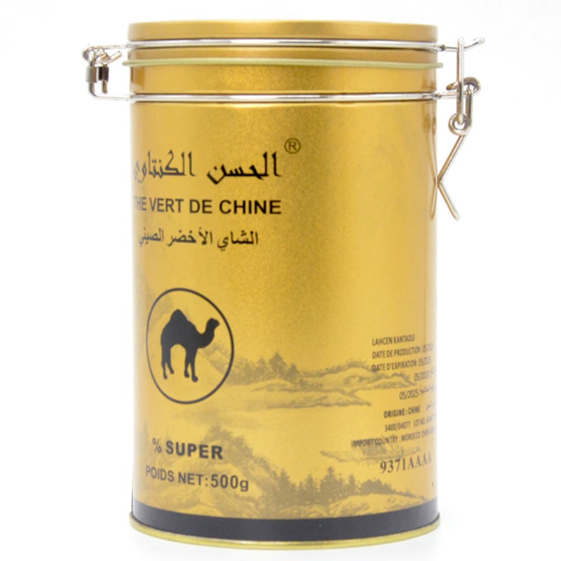
Explore our extensive selection of coffee tins tailored to different coffee brands. Protect your coffee's flavor with our high-performance sealing technology. Leading coffee roasters choose our premium tins for branding and freshness. Your coffee stays uncontaminated and clean with our certified tin packaging. Our coffee tins feature stunning HD prints to capture consumer attention.
Read More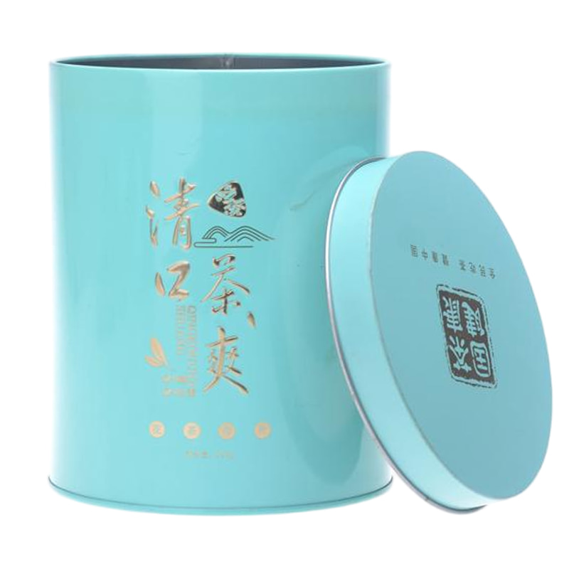
Our coffee tin range caters to every packaging need, from classic to modern styles. Innovative sealing ensures your coffee stays rich, flavorful, and long-lasting. Our coffee tins are the choice of well-known coffee companies worldwide. Count on our food-safe tins to protect your coffee from exposure and impurities. Elevate your coffee’s shelf appeal with bold, custom tin designs.
Read More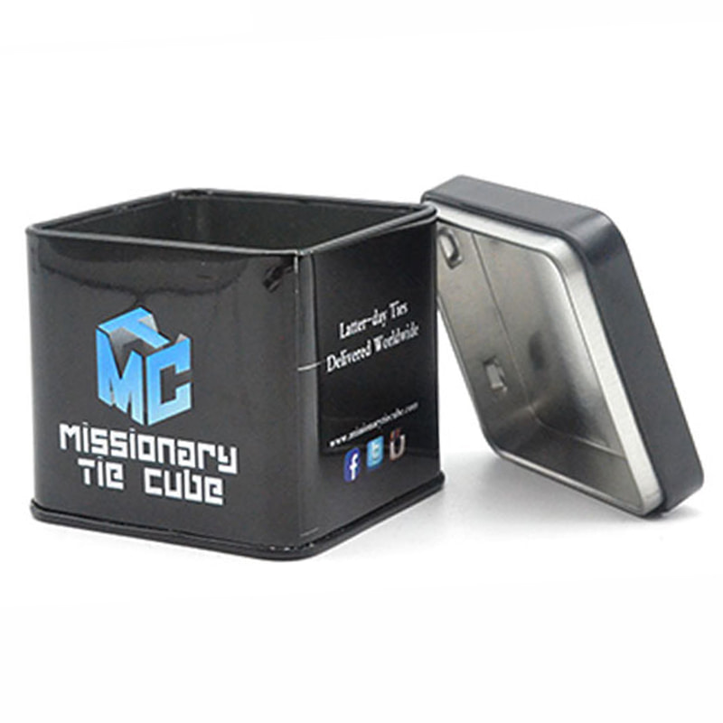
Choose from multiple coffee tin styles designed for diverse consumer markets. Keep coffee at peak freshness with our airtight tin technology. Reputable coffee labels rely on our packaging to maintain quality and stand out. We prioritize safety—our coffee tins meet strict food-grade standards. High-definition color printing brings your coffee branding to life.
Read More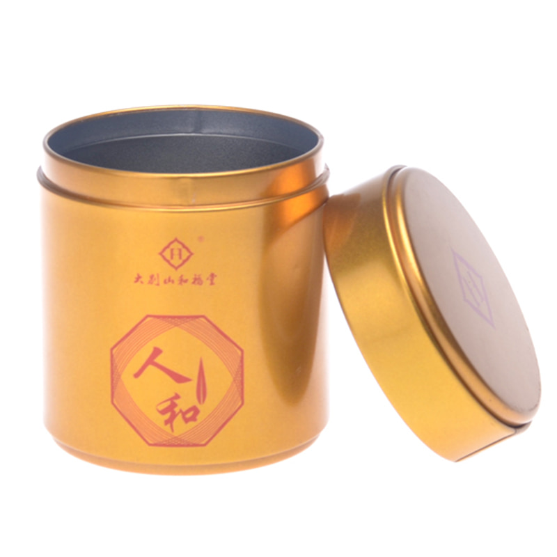
From small-batch roasters to large brands, we have coffee tins to match every need Your coffee stays fresher, longer, thanks to our modern sealing systems. Global coffee names turn to our tin cans for reliable, stylish packaging Certified food-safe materials guarantee your coffee stays untouched and fresh. Our tins showcase your coffee with stunning, detailed artwork.
Read More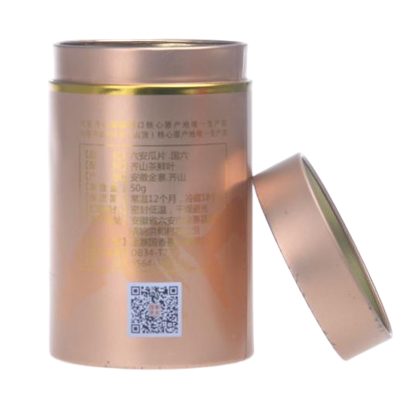
Our coffee tin solutions come in versatile shapes and sizes to fit your brand. We use cutting-edge tin sealing to preserve coffee taste and quality. Premium coffee deserves premium tins—trusted by industry leaders. Keep your coffee hygienic with our contaminant-free tin packaging. Impress buyers with eye-catching coffee tins designed to turn heads.
Read More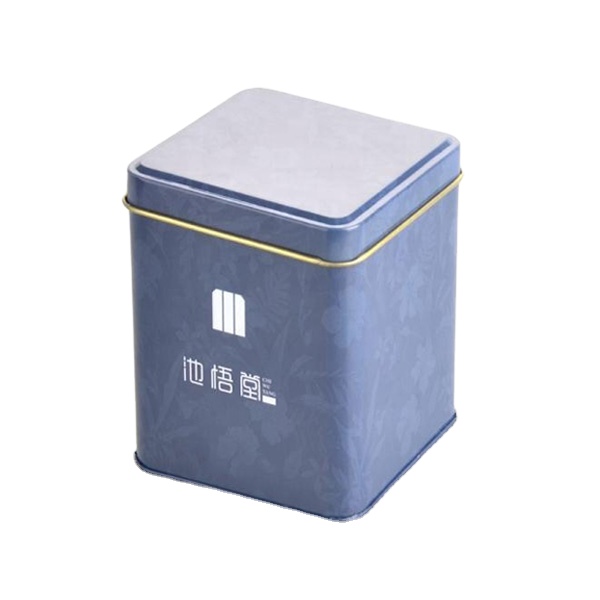
Airtight seal to keep coffee fresh for longer. Offer comprehensive coffee packaging services, from design to production, packaging and distribution. Well-known brands selling coffee around the world are our long-term customers, such as Twinings, Tetley, Bigelow. Attractive and eye-catching way to dareplay your coffee products. Professional Pantone and 4-color printing equipment,creating full, vibrant, printed color with unique designs.
Read More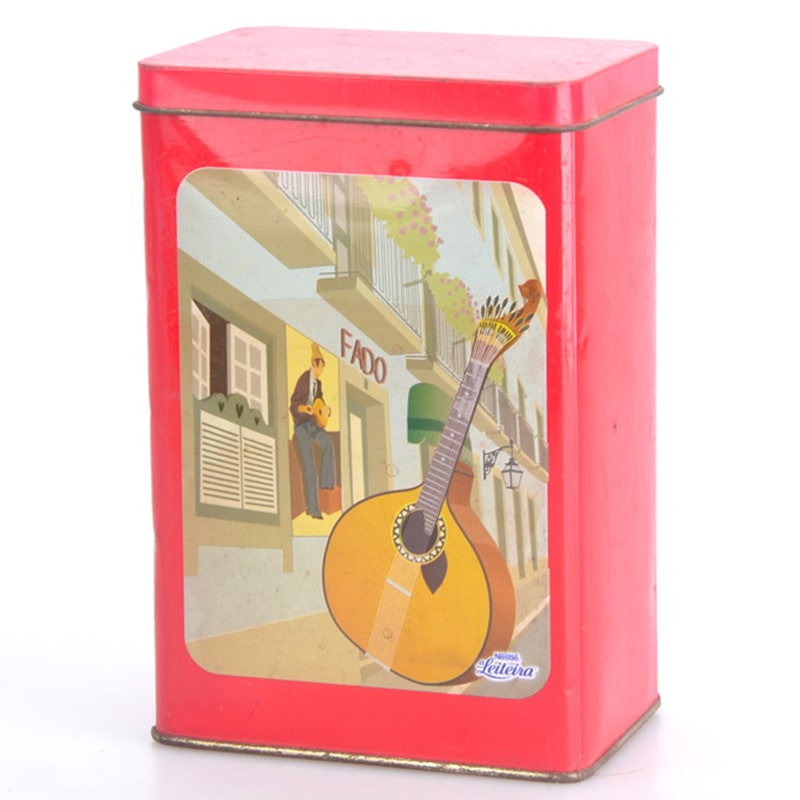
Find the perfect coffee tin packaging option for any market or product line. Superior sealing tech keeps your coffee's flavor profile intact. From boutique to global brands, our coffee tins are their preferred choice. Our tins meet global safety standards for secure coffee packaging. Our printing technology ensures your coffee tin is as rich in color as in taste.
Read More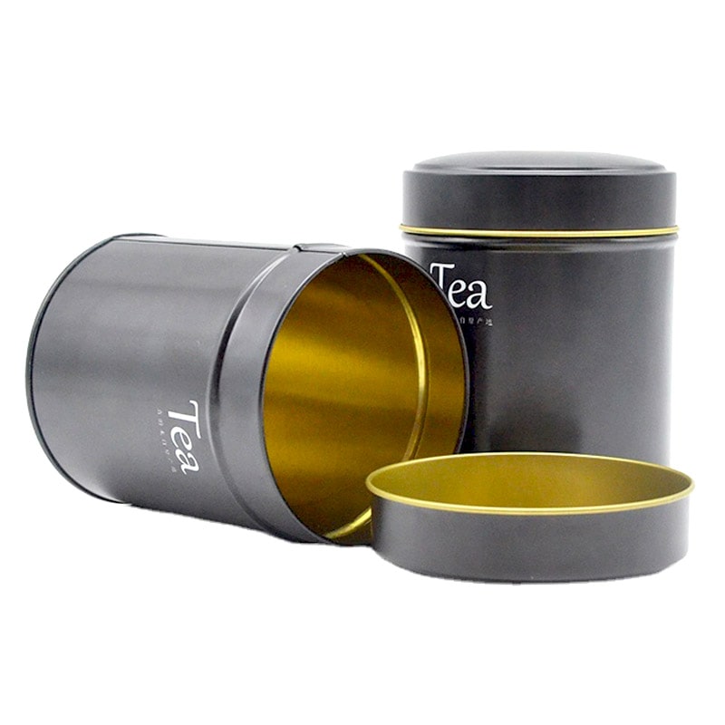
Easy to store and can be stacked, making it a great choice for businesses with limited storage space. Cost-effective, making it a great choice for businesses on a budget. Many long-term partnership including Lipton, Twinings and Tetley. Recyclable, making it an eco-friendly choice for businesses. Lightweight and easy to transport, making it ideal for commercial shipping.
Read More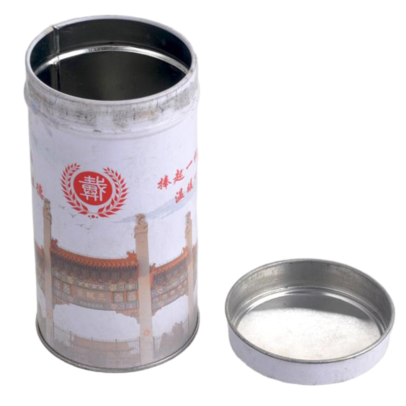
We customize coffee tins to align with specific market trends and customer needs. Extend your coffee's shelf life with our secure and airtight tin solutions. Leading coffee exporters choose our tins to deliver quality with every cup. Designed for food safety, our coffee tins protect against moisture and bacteria. Custom coffee tins printed with precision for maximum visual impact.
Read More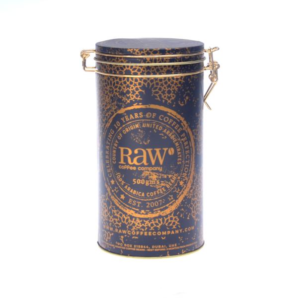
We offer you a variety of coffee tin packaging solutions to choose from. Advanced processes can bring your coffee bean good sealing and long time storage. Lipton, Twinings and Tetley, theses famous tea brands are our loyal customers. FDA approved food grade tinplate can make sure the absolute safety of your coffee packaging. Professional panton and 4-colour printing equipments ensure a high quality presentation of the tin boxes.
Read More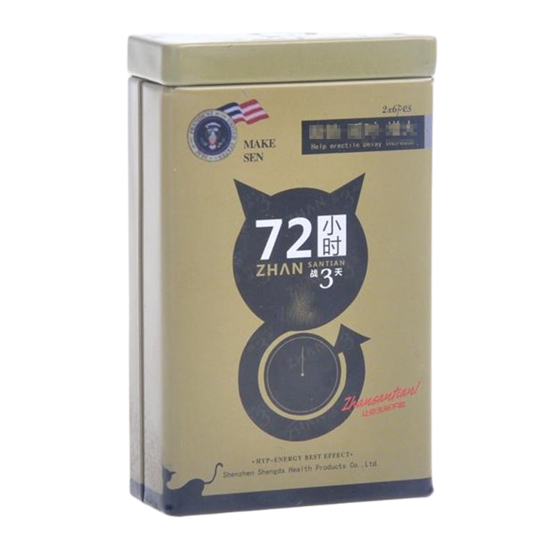
Our coffee tins cover a full spectrum of packaging requirements, both functional and aesthetic. Extend your coffee's shelf life with our secure and airtight tin solutions. Leading coffee exporters choose our tins to deliver quality with every cup. Trust our certified tins to preserve your coffee in a clean, safe container. Bold visuals meet function—our tins highlight your coffee in full color brilliance.
Read More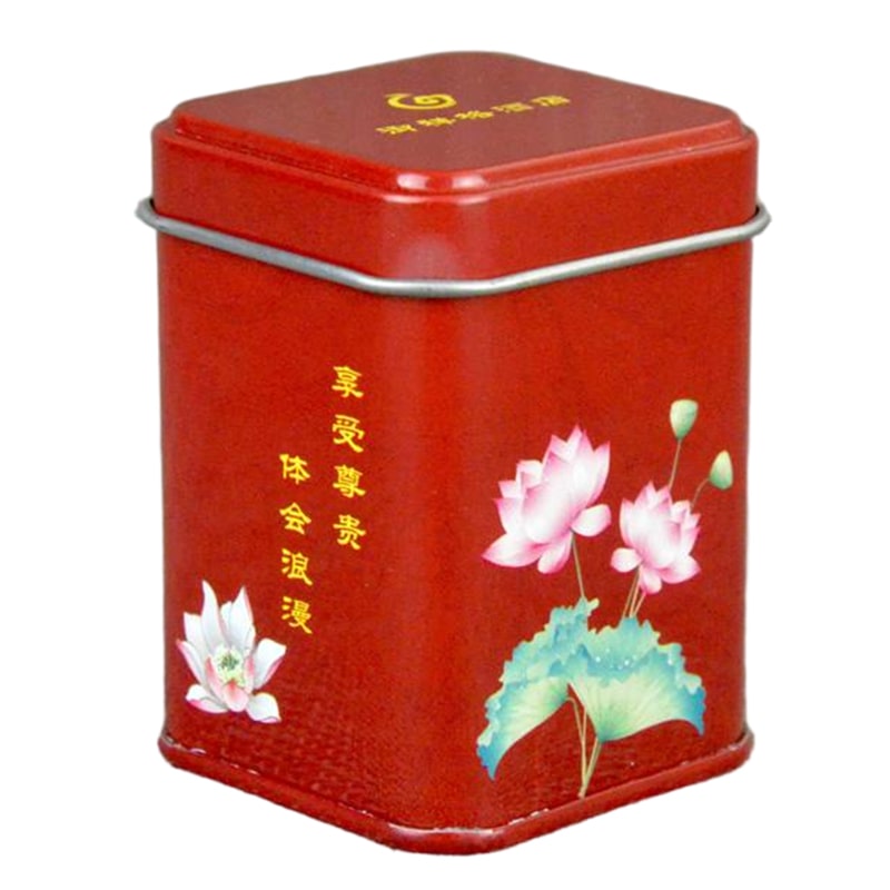
Explore a diverse selection of customizable coffee tin packaging crafted to elevate your brand identity. Our precision-sealed coffee tins are designed to lock in rich aromas and preserve coffee freshness for longer. Trusted by international coffee brands like Lavazza, Illy, and Nescafé for premium tin packaging solution Each coffee tin is produced using FDA-compliant food-grade tinplate to ensure safety and quality. We offer vibrant Pantone and CMYK printing to create coffee tins that stand out on any retail shelf.
Read More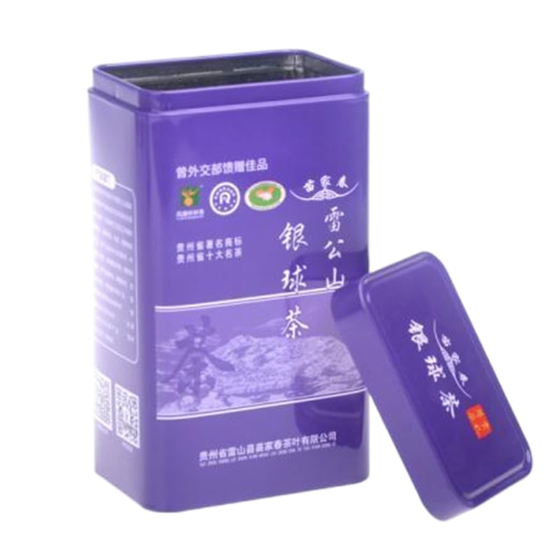
Discover a wide variety of coffee tin containers tailored to enhance your brand image. Airtight coffee tins expertly preserve coffee aroma and flavor. Top coffee brands rely on our coffee tins for premium packaging. We use food-grade tinplate in every coffee tin to meet FDA standards. Our coffee tins feature bold CMYK or Pantone printing for maximum shelf impact.
Read More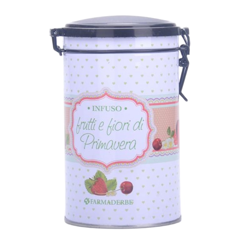
Choose from our extensive range of customizable coffee tins designed for impactful branding. Sealed metal coffee tins that maintain peak freshness over time. Used by global names such as Illy and Lavazza, our coffee tins deliver excellence. Safety first—our coffee tins are made from certified food-safe materials. Custom printed coffee tin boxes designed to attract attention in retail environments.
Read More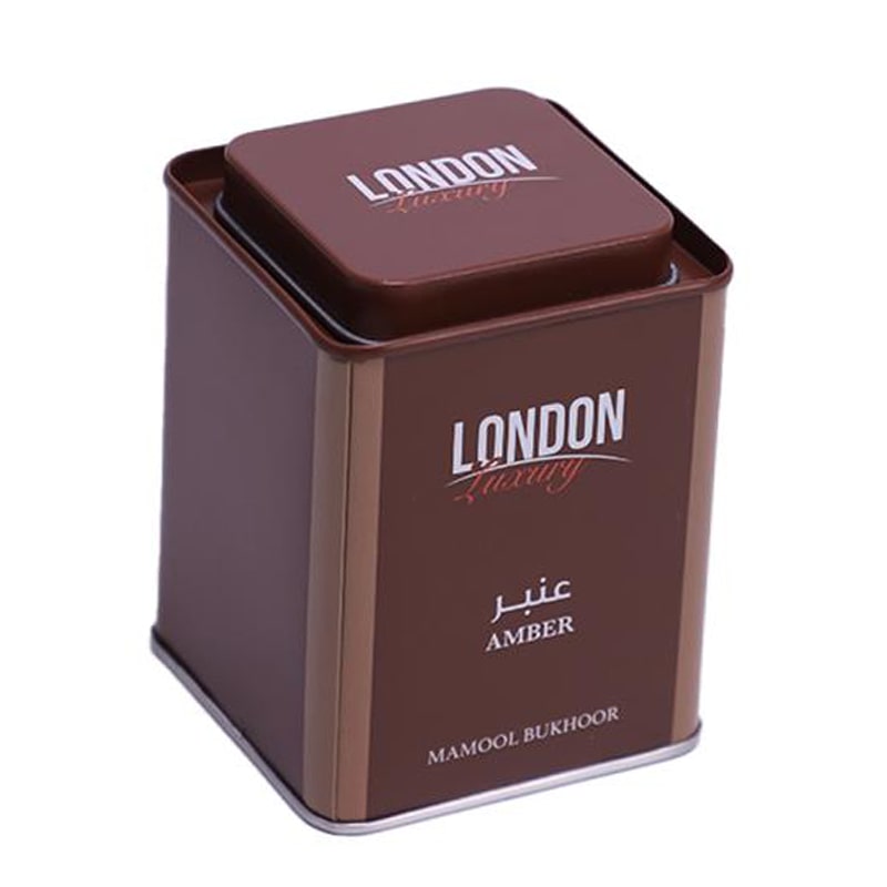
Elevate your product presentation with bespoke coffee tin packaging options. Preserve every note of your coffee with our airtight coffee tin containers. International roasters choose our tin packaging for quality and consistency. Coffee tins manufactured with FDA-approved tinplate for your peace of mind. Eye-catching coffee tins printed with your brand’s signature colors.
Read More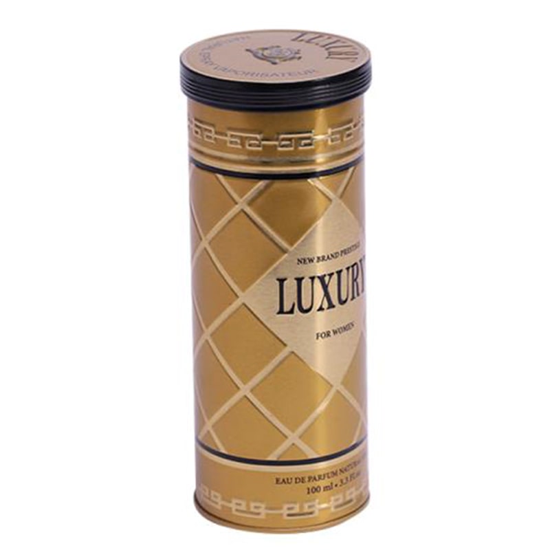
Our customizable metal coffee tins offer endless branding possibilities. Engineered coffee tins for maximum freshness and aroma retention. Leading coffee brands trust our coffee tins for their product presentation. Our metal coffee tins comply with international food safety standards. Enhance product visibility with vibrant printing on every coffee tin.
Read More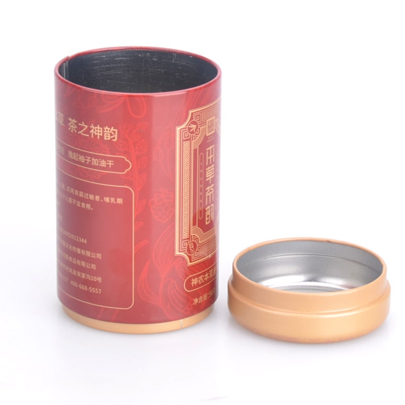
Custom coffee tin packaging solutions to make your coffee brand stand out. Long-lasting freshness starts with our precision-lock coffee tins. Renowned labels like Nescafé use our coffee tin packaging solutions. Crafted from premium-grade tinplate, our coffee tins prioritize safety and quality. Coffee tins with full-color printing that bring your packaging to life.
Read More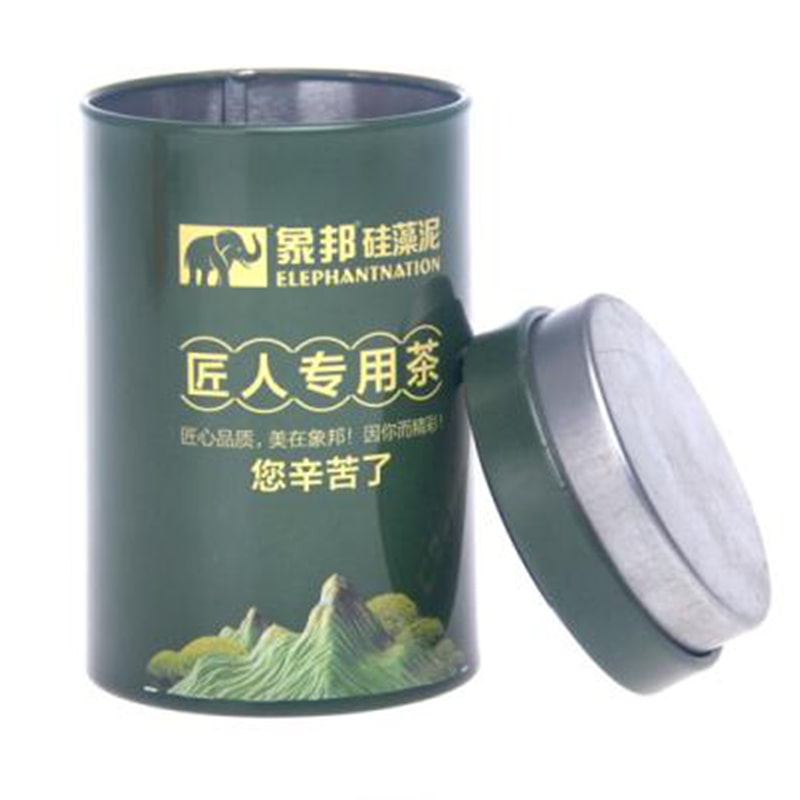
Design your own coffee tin box and strengthen your shelf appeal. Keep your coffee fresh with our sealed coffee tin packaging. Renowned labels like Nescafé use our coffee tin packaging solutions. Food-grade metal coffee tins built for global compliance and durability. Use Pantone or CMYK options to create distinctive branded coffee tins.
Read More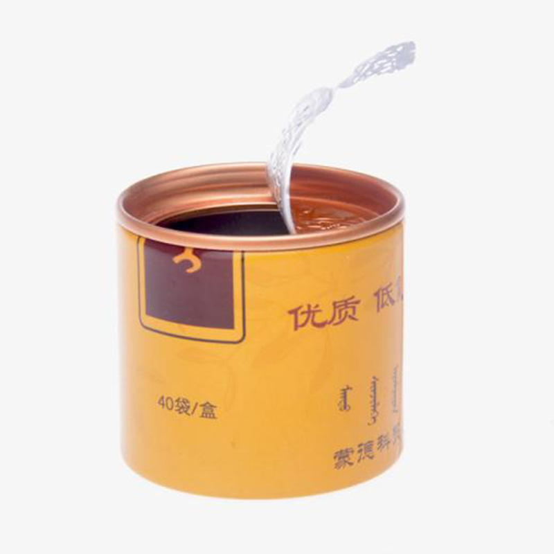
Unlock premium branding with personalized coffee tin containers in bulk. Our food-safe coffee tins ensure a longer shelf life and richer taste. Coffee tin packaging trusted by market leaders across the globe. Each coffee tin box is produced to meet strict hygiene and quality standards. Coffee tin packaging that blends aesthetics and functionality with high-quality printing.
Read More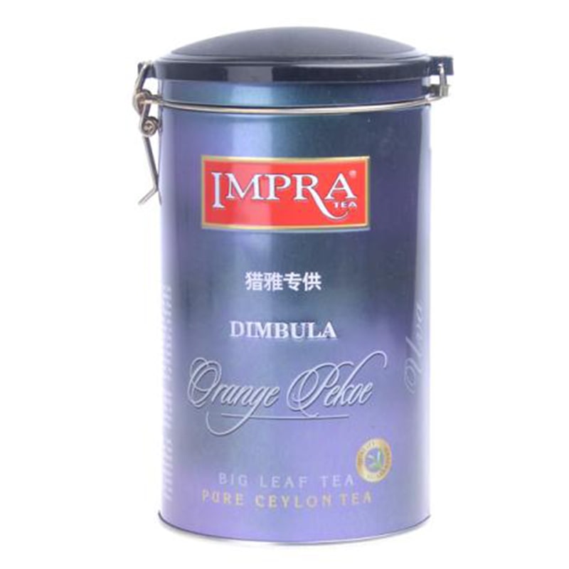
From minimalist to bold, our coffee tin packaging adapts to your unique brand style. Designed to seal in flavor, our metal coffee tins protect your coffee’s integrity. Recognized by international coffee producers for superior tin quality. Rely on our coffee tins for both safe storage and professional presentation. Boost shelf appeal with vivid custom-printed coffee tins.
Read More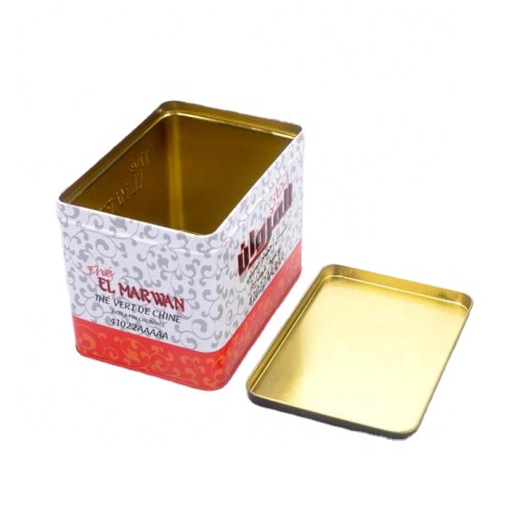
This large food cookie metal box container is designed for biscuit brands, cookie manufacturers, bakery gift suppliers and wholesale food packaging buyers that need a square biscuit tin with strong storage value. The large flat lid, food-grade tinplate body and reusable metal structure make it suitable for cookies, biscuits, butter biscuit assortments, candy, snacks and seasonal gift packaging.
Read More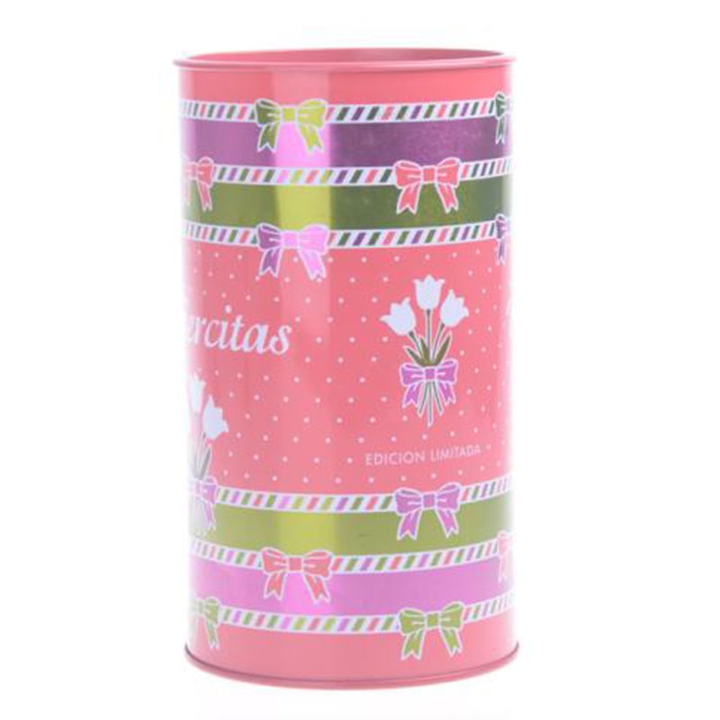
Coffee tin boxes engineered for brand recognition and market differentiation. Coffee storage tins crafted to preserve freshness from roastery to cup. Our coffee tins meet the global standards of top-tier coffee companies. Our coffee tin containers combine visual appeal with FDA-level food safety. Make your product unforgettable with branded, color-rich coffee tin containers.
Read More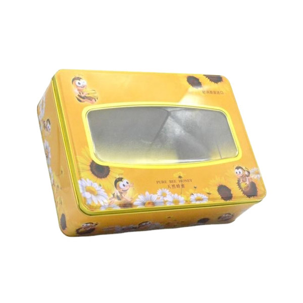
This custom wholesale cookie biscuit tin box with clear lid top is designed for bakery brands, biscuit manufacturers, gift suppliers and private-label food projects that need a strong square metal package with visible product display. The clear top window helps show cookies, biscuits, candy or chocolate before opening, while the food-grade tinplate body supports custom printing, labeling, inner packing and export-ready wholesale supply.
Read More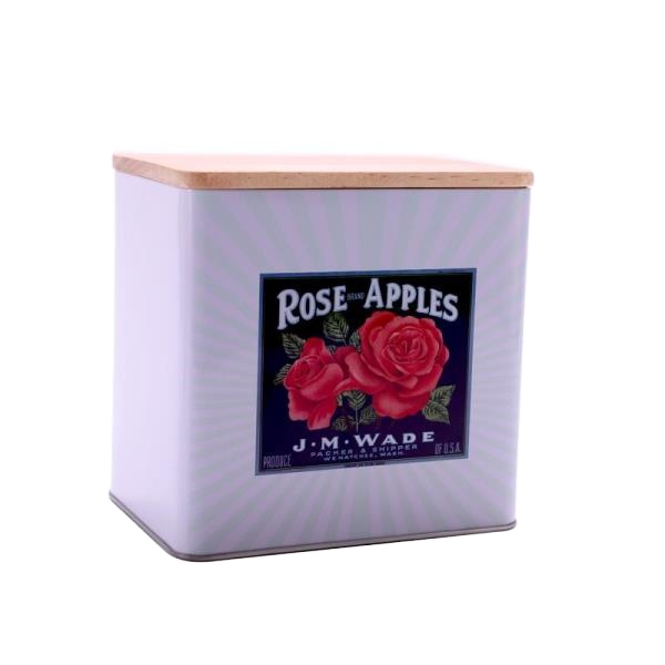
This large capacity food tin box with wooden lid is designed for brands that need a reusable metal container with a warmer, home-style presentation than a standard all-metal tin. The square food-grade tinplate body, flat custom-print surface and removable wooden lid make it suitable for cookies, biscuits, candy, tea, coffee, dry snacks, kitchen storage sets, farmhouse gift packaging and wholesale food tin box projects.
Read More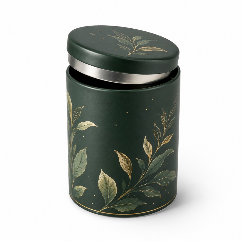
Our custom plug lid tea tin canister is designed for loose leaf tea brands, tea factories, importers, private-label buyers and gift packaging suppliers that need a clean, compact and reusable metal packaging solution. The lid includes an internal plug section that fits into the opening of the tea tin. When fully closed, the outer lid aligns closely with the body, creating a smooth and integrated appearance without a bulky overlapping edge. This structure is suitable for premium loose leaf tea, green tea, black tea, oolong tea, herbal tea and tea gift collections.
Read More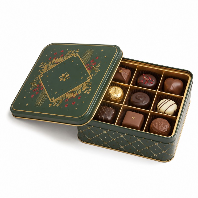
This custom square chocolate tin box is developed for confectionery brands, chocolatiers, gift suppliers, importers and private-label buyers packaging assorted chocolates in an organised presentation. A fitted divider separates each chocolate into an individual position, helping protect delicate shapes while creating a clear tasting sequence when the lid is opened. The square tin, compartment layout, surface printing, embossing and retail packing can all be customised for seasonal collections, premium gift sets and branded chocolate assortments.
Read More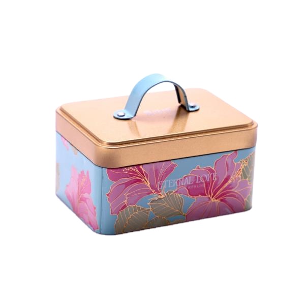
This food grade square cookie tin box with handle and lid is designed for cookie, biscuit, candy, chocolate and snack gift packaging that needs both portable storage and reusable value. The square food-grade tinplate body, fitted lid and plastic handle make it suitable for a cookie tin box with handle, gift tin box with handle, metal container with handle and custom retail packaging projects for bakeries, food brands, children’s gifts, holiday promotions and wholesale tin buyers.
Read More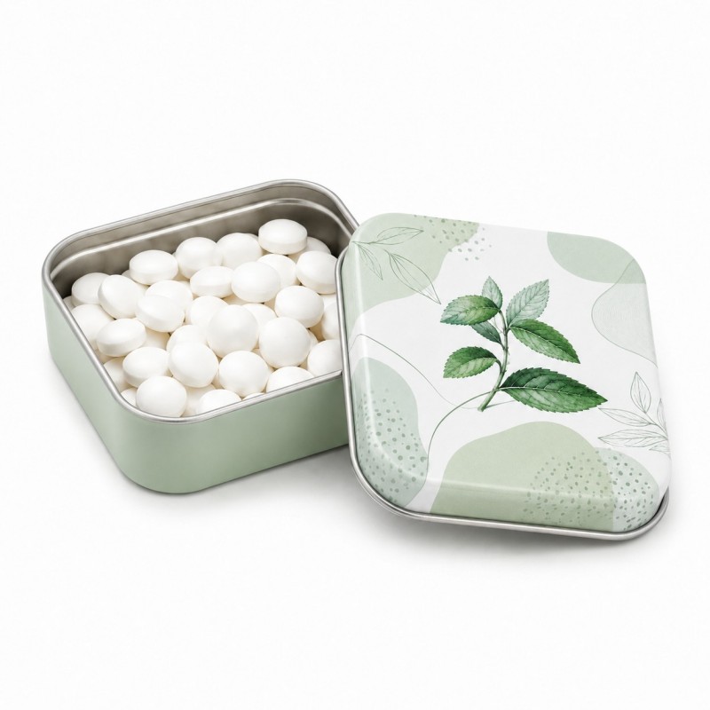
Our custom square mint tin box is designed for confectionery brands, mint manufacturers, promotional suppliers, importers and private-label buyers that need compact metal packaging for breath mints, compressed candy tablets, lozenges, hard candy and other small sweets. The square shape provides a balanced printing area, efficient shelf presentation and a convenient size for pockets, handbags, gift sets and checkout displays. Tin dimensions, lid fit, artwork, colour, surface finish and internal packaging can be customised around the actual mint size, filling quantity and target market.
Read More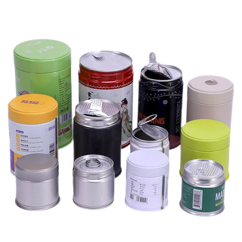
Give your matcha a distinctive first opening and a practical place in your customer's daily routine. This round matcha tin combines a single-use ring-pull inner seal with a reusable screw-top outer lid, bringing retail presentation and convenient reclosure into one customisable metal pack. Jinyu supplies empty matcha powder tins for tea brands, private label importers, specialty retailers and café brands. Develop your pack around a 30g, 50g or 80g target fill, then customise the tin body and lid with your artwork, colours and finish. The tins are supplied empty for filling by your business or packing partner.
Read More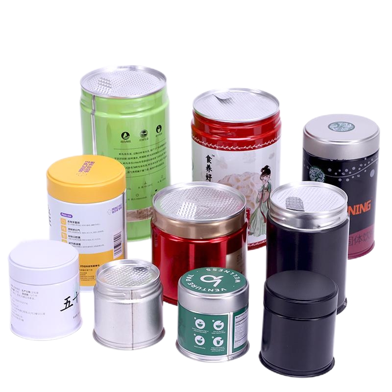
Make the first reveal part of your matcha brand. This custom metal tin uses a flexible aluminum foil peel lid: the customer lifts the foil tab and peels back the membrane to open the pack. The printable tin body gives your product a distinctive retail identity, while the foil closure is specified around your filling and freshness requirements. Jinyu develops empty matcha tin packaging for private label tea brands, specialty retailers, café collections and gift programs. Customize the artwork, dimensions, surface finish and outer-cover options to create a pack that suits both your product and your production process.
Read More
Durable and can be reused multiple times. Airtight, which helps to preserve the flavor and aroma of the tea. Variety of sizes and styles, making it easy to find one to fit your needs. Used to store other items such as spices, herbs, and other loose leaf teas. Highly durable and can protect your tea from moareture, light, and air.
Read More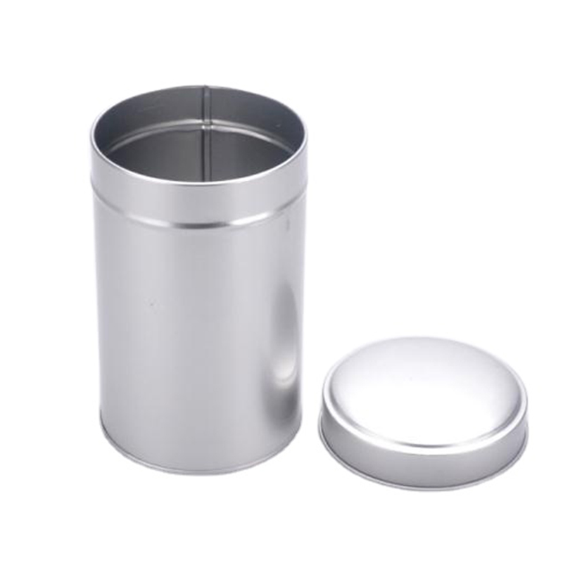
Durable and can be reused multiple times. Airtight, which helps to preserve the flavor and aroma of the tea. Variety of sizes and styles, making it easy to find one to fit your needs. Used to store other items such as spices, herbs, and other loose leaf teas. Highly durable and can protect your tea from moareture, light, and air.
Read More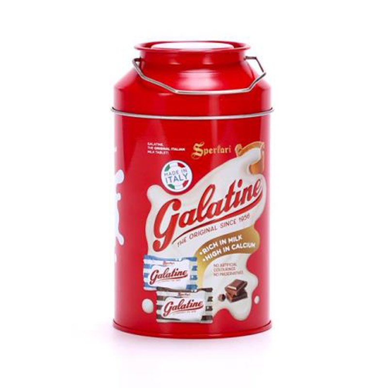
Sturdy and can be used multiple times. Airtight, maintain and preserve the flavor and aroma of the tea. Variety of sizes and design, effortless to find a tin that perfectly suits your requirements. Versatile and can be used to store a variety of items, including spices, herbs, and other loose leaf teas. Durable and provide excellent protection for your tea, shielding it from moisture, light, and air.
Read More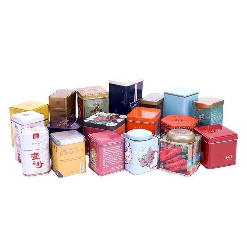
Assist in maintaining the freshness of your tea for an extended period. Enhance the perceived value of your tea offerings. A secure and airtight seal to aid in preserving the freshness and flavor of your tea. Durable and capable of withstanding the challenges of shipping and handling, our food-grade tinplate ensures reliability. A diverse range of sizes and shapes is available, simplifying the process of finding the ideal fit for your product.
Read More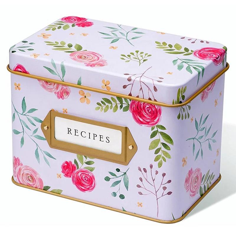
This farmhouse custom tin recipe box is designed for recipe cards, meal planning notes, family cooking collections, kitchen organization and branded homeware gift projects. The square metal recipe box combines durable tinplate storage, vintage kitchen décor style and custom printing flexibility, making it suitable for recipe card sets, kitchen accessory brands, cookbook promotions, retail gift boxes and metal recipe box wholesale programs.
Read More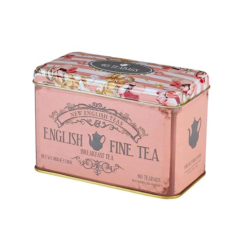
Robust and versatile for numerous applications. Secures an airtight seal, maintaining the tea's flavor and aroma. Offers a varied selection of sizes and styles, making it easy to find one that meets your needs. Used to store a variety of items, including spices, herbs, and loose-leaf teas. Exceptionally strong, ensuring your tea is safeguarded from moisture, light, and air.
Read More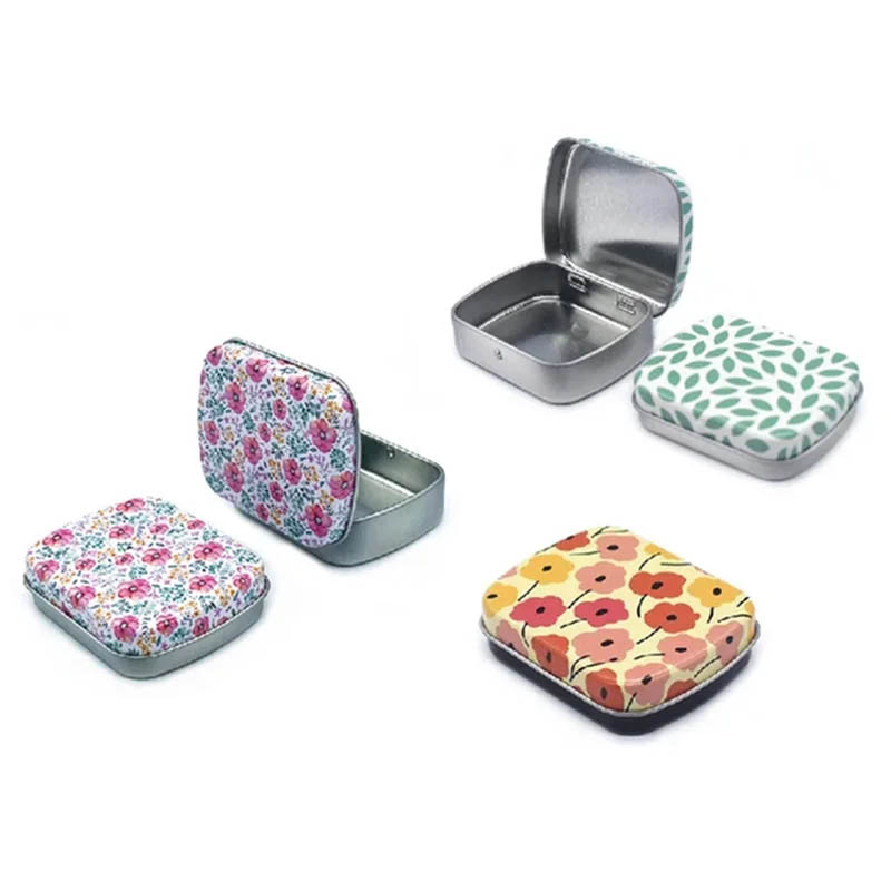
A small hinged lid jewelry tin box is designed as a compact metal storage solution for necklaces, earrings, rings and other small accessories. With a practical hinged lid structure and durable tinplate body, this mini jewelry storage tin provides a convenient way to organise personal jewellery while maintaining a neat and reusable appearance. Compared with traditional jewellery pouches or ordinary plastic organisers, a custom metal jewelry tin offers a stronger structure, longer service life and more opportunities for personalised branding.
Read MoreGet The Latest Information And Special Offers


 IPv6 network supported
 English
 Français
 Deutsch
 Español
 Português